This site uses cookies to improve your experience. To help us insure we adhere to various privacy regulations, please select your country/region of residence. If you do not select a country, we will assume you are from the United States. Select your Cookie Settings or view our Privacy Policy and Terms of Use.
Cookie Settings
Cookies and similar technologies are used on this website for proper function of the website, for tracking performance analytics and for marketing purposes. We and some of our third-party providers may use cookie data for various purposes. Please review the cookie settings below and choose your preference.
Used for the proper function of the website
Used for monitoring website traffic and interactions
Cookie Settings
Cookies and similar technologies are used on this website for proper function of the website, for tracking performance analytics and for marketing purposes. We and some of our third-party providers may use cookie data for various purposes. Please review the cookie settings below and choose your preference.
Strictly Necessary: Used for the proper function of the website
Performance/Analytics: Used for monitoring website traffic and interactions
When your company adopts multiple SaaS solutions to drive productivity, you unknowingly create a perfect storm for data fragmentation. Your customer information lives in Salesforce, while your support tickets are in Zendesk, your product usage data in Mixpanel, and your marketing campaigns in HubSpot. Sound familiar?
Without effective UX analytics that goes beyond collecting data, you’re losing valuable customers. Why UX analytics should go beyond quantitative data. Methods for collecting and analyzing UX data. UX analytics involves gathering, analyzing, and interpreting data about how users interact with your product or service.
This format efficiently gathers quantitative data and identifies common themes. For more survey question types see here: [link] Balancing qualitative and quantitative data: The role of customer insights Achieving a balance between qualitative and quantitative data is essential for a well-rounded understanding of customer experiences.
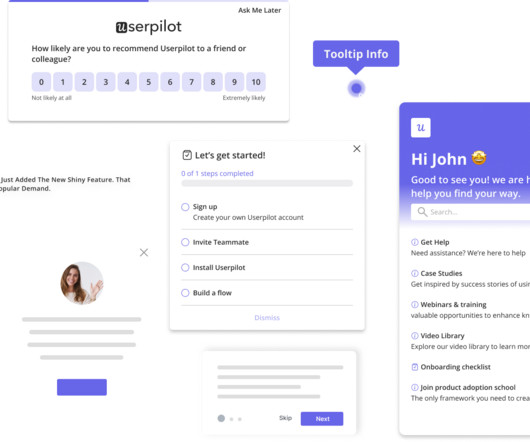
Custom dashboards to track key metrics at a glance. Analytics reports like paths, funnels, and cohort tables for visualizing user behavior data. for collecting user sentiment data. Pendo The dashboard on Pendo. Additional reports: You get a built-in Product Engagement Score dashboard. UserGuiding dashboard.
When one tool gathers feedback via email and another through your website, consolidating all that data and customer feedback can be nearly impossible. Most organizations struggle with disconnected tools that create data silos and incomplete customer insights.
Pro Tip: Pair your quick wins with data. A dashboard showing metrics like feature adoption or user engagement amplifies your credibility. Tailor Your Communication: Adapt your messaging for different audiences, whether its engineering teams or senior leadership. It shows youre thoughtful, analytical, and focused on results.
Last month we turned our attention to data – unleashing new features that help you improve how you collect, access, and use first-party data to influence your product and scale your business. Increase engagement with enriched mobile push messages. Check out how to create these rich push messages here.
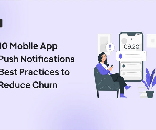
This leads to errors like sending a product update notification at 1 AM or showing the wrong message to the wrong user segment. There are no inbox filters, no distractions, just a direct line from your message to their attention. Personalization If your push message could be sent to everyone, it probably shouldnt be sent to anyone.
Marketing teams under pressure to perform – For teams tasked with proving ROI, brand health metrics provide the data to validate strategy, guide messaging, and justify spend. Define clear goals – Determine the key business decisions your brand data will support (e.g., campaign planning, market entry, customer segmentation).
Collect customer data to calculate complex formulas for tracking metrics, monitor customer health scores, and resolve support tickets while continuously trying to improve retention and expansion. Evaluate data hygiene & availability : Assess the quality of customer data you’ll be feeding into the platform.
You can then visualize the data as trends, funnels, paths, and heatmaps. Leverage welcome surveys to gather the data. Teach them to use data to identify customers who are ready for expansion. Well, you can easily track the metrics from one of Userpilot’s analytics dashboards.
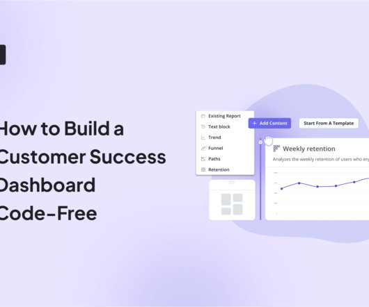
Wondering how to build a customer success dashboard for your team? From the article, you will learn what a customer success dashboard is, why you need it, and what metrics it should include. And how to build a dashboard for your customer success team using Userpilot analytics ! Populate your dashboard with up to 30 reports.
Once your landing page is live, you can start collecting leads, offer a preview of your app press and early adopters, and integrate with an analytics or A/B testing tool to test variations of your messaging strategy. Sprout Social has an in-depth guide to demographic data from the most popular social networks of 2020.
Would you like to learn how to design a SaaS metrics dashboard for your team without any coding? In the article, you will find examples of various SaaS dashboards and learn how to create them with Userpilot analytics. If so, you're in the right place! Let's dive in, shall we? To name just a few.
They track 47 different key performance indicators (KPIs) in their mobile analytics platform , spend hours debating dashboard numbers, yet can’t predict which users will churn next week The problem here isn’t a lack of data. Teams are drowning in the wrong usage metrics while missing important behavioral data signals.
A typical workflow involved looking at a dashboard full of charts with metrics sliced and diced by various attribute combinations. A typical operational dashboard we used before doubling down on traces. Tailoring our message helped to lock in support. To mitigate the problem we decided to double down on tracing telemetry.
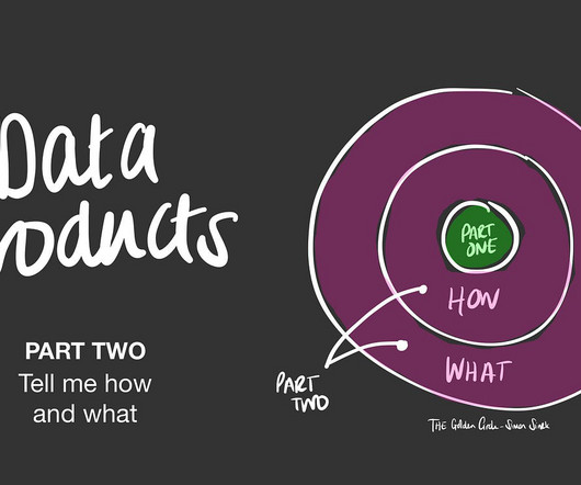
In the first part of this series I covered the why behind data products. In the previous article I gave examples of some of the data products you interact with everyday. The key thing to remember is that a data product is “ …facilitating an end goal using data ” (DJ Patil).
mParticle is the customer data platform for brands leading the CX revolution. Unify data and simplify partner integrations with enterprise-class security and reliability. The integration between mParticle and Apptentive allows mobile app providers to build a bond with their customers through the data that defines them.
Mobile slideouts are small, non-intrusive messages that slide into view on your app screen. For example, a slideout can be used to introduce the main dashboard with a brief walkthrough of essential tools they can access. So use concise messaging in your slideouts, along with a clear call to action (CTA).
How do you manage all of that data? This in-app analytics tool helps companies make data-driven iterations to their apps and gain a better understanding of how product changes impact customer satisfaction. Appsee is a mobile app analytics platform that focuses on qualitative data and is designed to help inform UX decisions.
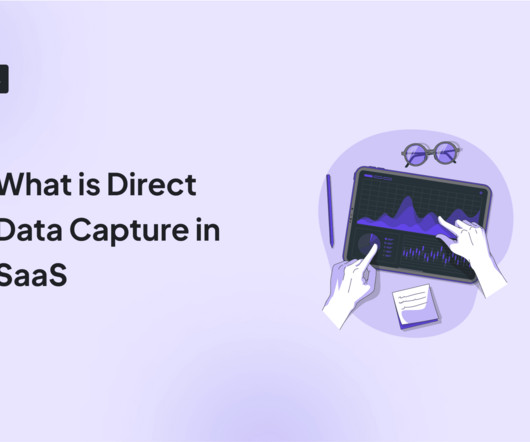
Tired of spending big on third-party data providers and not getting the results you want? Say hello to direct data capture! By collecting data directly from your customers, you can cut down on costs, gain accurate insights, and maintain full control over your data. Gather direct data with user interviews.
It’s what you do with the behavior data your app collects. And by behavior data, I dont mean installs (thats the easy part). Mobile app tracking captures data on how users interact with your app, including actions such as screen views, button taps, session length, and feature usage. What is mobile app tracking?
When you’re building a mobile product , data is your lifeline. Now, you can track how users interact with your app across platforms, understand their behavior in context, and respond with in-app experiences, all from the same dashboard. But if you ask me, theres simply no one-size-fits-all solution.
It could include conducting user interviews and surveys, analyzing product usage data, and tracking customer feedback , to name a few. Qualitative research Qualitative research focuses on collecting and analyzing non-numerical, descriptive data. Let’s explore each type in detail to see which is more suitable for your context.
These were painstakingly thorough with tables full of dialog copy, error messages, and more. Instead of detailing dialog copy and error messages, the designer would take a first stab at them, the product manager would suggest updates during the design reviews, and the copywriter would review and finalize it.
mParticle is the customer data platform for brands leading the CX revolution. Unify data and simplify partner integrations with enterprise-class security and reliability. The integration between mParticle and Apptentive allows mobile app providers to build a bond with their customers through the data that defines them.
New features like conversation data attributes , improved rules and assignment logic , and bots that help you triage conversations make it much easier to handle complex queries. You can also anticipate points where users may need a little extra help and encourage them to start a conversation with support – right from the carousel message.
One look at your mobile app analytics dashboard, and you just want to shut your eyes and scream in frustration. What decision will this data influence? Data is not fulfilling its value if it is not making an impact on your product. Think about how you determine action based on data. Craft push notifications in Userpilot.
Data PM: organizations dealing in data products (building AI/ML based products) prefer a PM with data science background so that they can appreciate the problems well and being able to work with data engineers/scientists. Data vs Intuition. Hard Skills Required for the Role. A PRD needs no introduction.
Demandbase enables companies to deliver personalized online ads to specific people at specific companies across the web while refining the message to try to convert them into customers. We use it for: Sending targeted messages to visitors on our website. Clearbit – data enrichment. So let’s say Joe works for Pfizer.
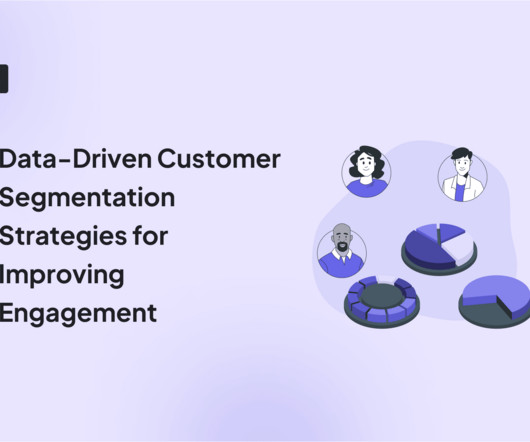
Wondering how data-driven customer segmentation can help your SaaS product grow? TL;DR Data-driven customer segmentation involves dividing your customer base into sub-groups sharing certain characteristics, like age or survey responses. Userpilot offers analytics and feedback features for collecting data necessary to segment users.
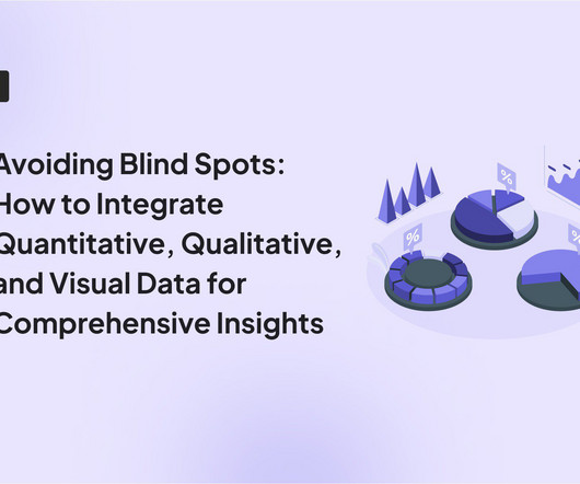
User feedback is valuable , but without data, its just opinions. To eliminate these blind spots, you need to combine quantitative, qualitative, and visual data. This article will cover: Why combine quantitative, qualitative, and visual data? Key differences between data types. How to collect each data type.
But all too often the way the underlying data is collected makes NPS little more than a vanity metric, easily rigged to give the impression of positive customer sentiment, leading to shallow insights and false assurances. In order to provide true value you need a robust and reliable data set. Consider your follow-up message.
Users share sensitive data and entrust performing operations with their finances, so even minor defects in fintech products destroy confidence, make users question the company’s expertise, and what’s worse, abandon an app. Today, many users can’t fully benefit from biometrics because of a long and sophisticated way of registering data.
it might be a written document, presentation, data analysis, design, video, etc.). Depending on the output, the trailer can appear in different formats – from a one-page project overview to highlight reels, a dashboard, or designs. You’ve addressed your concept and problem, and planned the steps you need to take to create your output.
Applying data and science to scaling has become easier because of the shift that’s happened in the software industry over the past 15 years, from outside sales to inside sales. This has created large amounts of data for running teams. . A data-driven framework for scaling. I think that’s message-market fit.
It typically involves welcome messages, product tours , in-app guidance, and support materials aimed at driving user activation , retention, and long-term engagement. This approach makes sense for a data-driven product like Amplitude. The survey also allows for basic customization, such as branding colors.
Our search clusters contain more than 200TB of customer data, store more than 100 billion documents and, on at the peak on an average day, serve more than 13 million queries every minute. ” Taking down data-heavy instances takes a long time as data might need to be relocated for clusters to remain available.
That painful choice ends today as we unveil an array of new features that range from advanced ticketing workflows to new Inbox views, from beefed-up Reporting dashboards to sophisticated asynchronous support. These are deep, powerful features that significantly uplevel the Intercom experience across the Inbox, Messenger, Reporting, and more.
With the right strategy and proactive support tools – think Outbound Messages , Product Tours , Mobile Carousels , and Banners – you can alert customers to known issues, like delivery delays, bugs in your product, and website downtime. Here are our tips: Gather valuable conversation data fast. Quantitative data is meaningful.
Whatfix delivers context-aware guidance that helps users correctly complete sensitive tasks like handling patient documents, uploading payroll data, etc., With a shared dashboard and content strategy, you can manage flows, tooltips, and updates without duplicating effort. reducing compliance risks and support tickets.
I think a data visualization dashboard would be great as a first screen in the back-office.”. Because they need to access each report individually, get the data from each and calculate the metrics in a spreadsheet. The original request was to ‘add a data visualization dashboard as a first screen on the product’.
In addition, balancing feature rollouts, targeted messaging, and feedback loops across mobile and web often feels like spinning plates. Userpilots localization takes this further by automatically translating flows and messages based on a users geography into up to 32 languages. Also, consider time zones when scheduling messages.
By regularly checking your analytics data, you will proactively spot issues and find ways to resolve them. As you read through, you will learn the different UX data types and how to measure them. The data obtained is useful for user journey mapping and creating in-app experiences that make customers want to stick.
We organize all of the trending information in your field so you don't have to. Join 96,000+ users and stay up to date on the latest articles your peers are reading.
You know about us, now we want to get to know you!
Let's personalize your content
Let's get even more personalized
We recognize your account from another site in our network, please click 'Send Email' below to continue with verifying your account and setting a password.


Let's personalize your content