This site uses cookies to improve your experience. To help us insure we adhere to various privacy regulations, please select your country/region of residence. If you do not select a country, we will assume you are from the United States. Select your Cookie Settings or view our Privacy Policy and Terms of Use.
Cookie Settings
Cookies and similar technologies are used on this website for proper function of the website, for tracking performance analytics and for marketing purposes. We and some of our third-party providers may use cookie data for various purposes. Please review the cookie settings below and choose your preference.
Used for the proper function of the website
Used for monitoring website traffic and interactions
Cookie Settings
Cookies and similar technologies are used on this website for proper function of the website, for tracking performance analytics and for marketing purposes. We and some of our third-party providers may use cookie data for various purposes. Please review the cookie settings below and choose your preference.
Strictly Necessary: Used for the proper function of the website
Performance/Analytics: Used for monitoring website traffic and interactions
In SaaS, a customer onboarding dashboard can become a massive product analytics tool to understand and optimize the user journey. But what type of dashboards can you use to analyze your onboarding process? Let’s explore how a customer onboarding dashboard works and see different examples. Steps breakdown.
A customer sentiment dashboard is a great way to visualize customer feedback and see what users love (or hate) about your product. TL;DR A sentiment analysis dashboard typically integrates information from multiple data sources, such as social media posts, customer reviews, survey responses , and customer service chats.
In SaaS, a new user activation dashboard can become a massive product analytics tool to understand and optimize the user journey. But how can a dashboard for user activation can help you engage more users? What is a new user activation dashboard? moment ," impacting user retention and satisfaction.
One of these features you should look for is dashboard linking. The following article will delve into dashboard linking, its advantages, and potential benefits across various industries. What Is Dashboard Linking? In embedded analytics , dashboard linking refers to the ability to connect and navigate between multiple dashboards.
Dashboard design can mean the difference between users excitedly embracing your product or ignoring it altogether. Great dashboards lead to richer user experiences and significant return on investment (ROI), while poorly designed dashboards distract users, suppress adoption, and can even tarnish your project or brand.
One of these features you should look for is dashboard linking. The following article will delve into dashboard linking, its advantages, and potential benefits across various industries. What Is Dashboard Linking? In embedded analytics , dashboard linking refers to the ability to connect and navigate between multiple dashboards.
Based on your current dashboard, it looks like most users churn before completing onboarding. Bad data leads to bad decisions, whether that means duplicated records, misfired onboarding flows, or false signals in your dashboards. Create shared definitions and stick to them. Which features need attention?
Problem Brief Over a span of 4 weeks, we tested Civians platform and created design solutions to improve the overall user experience of the dashboard. We also encouraged them to think out loud while they were navigating the dashboard, to help us uncover their mental model and identify hidden insights. It definitely wasnt there earlier!
If this definition leaves you scratching your head, don’t worry. The product owner is accountable for “developing and explicitly communicating the product goal.” The entire Scrum team is “focused on one … product goal” at a time. Scrum is a simple framework designed to facilitate the development of complex products.
Primarily there are 3 major aspects to understanding and performing well as a Product Manager, which are as listed below: Understanding the Role Definition Hard Skills required for the Role Soft Skills required for the Role. Understanding the Role Definition. Definition of PM role. Executing the roadmap.
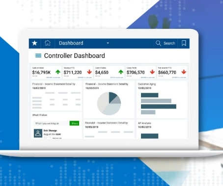
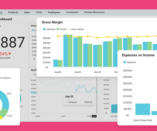
Throughout this traditional definition, you’ll notice an emphasis on data, typically taken to mean quantitative metrics. Dashboard : Customize the analytics dashboard or choose from pre-built ones to easily visualize and compare key metrics over time. Think about what this means for a second.
Reports and dashboards : Presents data in a digestible format, providing real-time insights and key performance indicators to help teams monitor progress and make informed decisions. Reports and dashboards Good data products must present data in an easily digestible format, often using graphs, charts, and tables.
Key elements include definition, target audience, key benefit, category, competitive advantage, and differentiation. Here are the key elements of a positioning statement: Definition : A concise summary of your product’s offer in the market. Choose a positioning strategy based on price, competitors, quality, features, or benefits.
Userpilot allows you to create onboarding flows without coding and enables tracking activation rate and related metrics from a single dashboard. One of the stand-out features is custom analytics dashboards. Userpilot’s New Users Activation dashboard. Want to join them? Book the demo! What is the customer activation rate?
But as we progressed in our customer discovery, we were able to refine our target audience hypothesis significantly by tightening the definition of our best customer to B2B sales professionals in large enterprises in the technology and financial services industries working in account executive or sales development roles.
TL;DR According to one definition, the level of effort includes all the work needed to successfully deliver the project. A more limited definition includes all the project support activities, like creating documents and managing stakeholders, but no actual work on the deliverables, like writing code. Asana dashboard.
This could be as simple as running a query or creating a custom dashboard in your analytics tool. Use visualizations – incorporating visual aids such as charts , graphs, and dashboards will make complex information more understandable and memorable. This doesn’t require any coding and comes with a user-friendly interface.
Questions about production: We wanted our definition to be wide, generic, and representative of the broad scope of workflows we cater for. Armed with our own definition of observability, we assessed our existing practices and formulated a problem statement. A typical operational dashboard we used before doubling down on traces.
Userpilot is a product growth platform that you can use to collect, visualize, and analyze user behavior data in custom dashboards. It gets better: Userpilot supports custom analytics dashboards , so you can view all the data in one place without switching between reports or tools. Book the demo to learn more!
The active user metric is commonly used to measure app performance, but the definition of an active user can vary depending on the product. A popular use case for this is analytics tools; people don’t use them daily, but most teams check their analytics dashboards at least once weekly.
It turns out it was over 35 forms that were riddled with conditional logic, a redundant backend ticketing system, several dashboard views and needed to cater to a myriad of job functions. I initially thought ticketing was made of a few components, a couple forms and one or two workflows.
But what is the definition of augmented analytics, who is it for, and how does it work with embedded analytics are all questions that many people still don’t know the answer to. Originally from Augmented Analytics Guide: Definition, Examples & Use Cases and written by Bilyana Petrova. Harness the Power of Data. Request a Demo.
Userpilot also has other analytics dashboards built into the platform that show you other data like product usage, feature adoption, user engagement, and behavioral analytics. Here’s a sneak peek at what Userpilot’s analytics dashboards look like: Get your free Userpilot demo today!
It will also analyze and summarize the results in a dashboard for easy sharing with other team members and stakeholders. It also offers interactive heatmaps , navigation paths , and mouse paths for granular analysis as well as a dashboard with usability metrics, including the System Usability Scale (SUS).
Define the definition of success at that particular stage (from your user’s point of view). Pendo’s dashboard. The post User Adoption in SaaS: Definition, Strategies, Tools, and More appeared first on Thoughts about Product Adoption, User Onboarding and Good UX | Userpilot Blog. Here’s an example: 4.
Tools like Userpilot allow you to create custom dashboards , so you can track all the key metrics from one place. Welcome screen created in Userpilot. Monitor performance and continuously iterate As you implement changes, track their impact on product performance. Don’t stop there.
Define the definition of success at that particular stage (from your user’s point of view). Pendo’s dashboard. The post User Adoption in SaaS: Definition, Strategies, Tools, and More appeared first on Thoughts about Product Adoption, User Onboarding and Good UX | Userpilot Blog. Here’s an example: 4.
Finally, you can use Userpilot to track all your value-based product metrics from one dashboard which you can customize to fit your needs. The analytics features like Funnels and Paths can also help you spot and remove friction from the user journey. This is to help customers reach value in less time. Funnel analysis in Userpilot.
An analytics dashboard can make it easier to track important metrics over time. Monitoring these SaaS metrics helps you see what’s working and what needs improvement. Review and analyze the data regularly to identify trends and insights. This can show you areas where your strategy might need adjustments.
Ensure the dictionary definitions are agreed upon by stakeholders. And that definitely isn’t z.” MOCK IT UP It’s a lot easier to build a dashboard in Slides or Sheets than in your BI tool. A *business definition* for a “connected call” might be, “any call in which we speak to a live person for any length of time.”
The problem with that definition, however, was that he had no validation process in place, and his technical focus caused him to ignore things such as marketing. You need to start investing in things like systems, automation, feedback loops, and metrics dashboards. Build More Product. How do you Become a Truly Scalable Product Manager?
Today, they regularly remind themselves of the right KPIs with standardized definitions and frameworks. This snippet from a Miro board includes some of the definitions they’re working off of. The product trios at Botify now use standardized guidelines and definitions for their KPIs.
The definition of the ideal customer – the demographics, the characteristics, the industries – comes from Product Management. The fact is that Marketing doesn't decide who to target with their programs - defining the ideal customer and segment is #prodmgmt's responsibility! Click To Tweet.
One example: the script currently runs in CLI mode with arguments, but it’s not implemented in the latest-best-Python way, and I’d definitely want to correct that. Data Layer 2: Static Generation, Dynamic Dashboards As you read this post, you’re benefitting from “static site generation.”
Dashboard/Admin Panel This feature is perhaps the most common one as a dashboard or admin panel is present on any type of mobile app and not just on insurance ones. Let’s have a look at some definite benefits bestowed by an insurance mobile app. Let’s begin.
By definition, customer retention takes a long time for software companies to figure out, because it might take up to a year to know whether a customer will renew or not. These are some of the inputs that businesses can put into a revenue cycle management (RCM) dashboard to understand if it’s scaling profitably.
as one would expect, had a lot of experience in setting systems up, keeping everything running and organized, with proper procedures and dashboards in place. Numbers Are Meant to Give You Ballpark Figures This creates a lot of confusion since numbers and goals are specific by definition. You might want to be even more specific?—?reduce
These are very different points of view, that would bring you to very different definitions at the end. That’s great for a general conversation but not for the actual definition process. Doing so not only helps you with the definition itself but also gives you a much deeper understanding of the metric you are eventually going to have.
A good example of the power of data is being shown by the product managers at Bacardi and Mercedes-Benz who have turned in part to a dashboard of analytics that has helped them to extend their product development definition. Just having access to the data is not enough. Examples of this can be found at Bacardi and Mercedes-Benz.
Communicate findings effectively A well-structured custom dashboard makes it easier for you to share insights across teams. When we launch a new feature, we create a funnel dashboard to measure how many users discover, activate, and keep using it. Looker Studio: Best for creating free, customizable dashboards with Google integrations.
For example, if your team’s operational dashboard needs to be tweaked, and it requires little effort, but never becomes a priority, that sounds like an excellent opportunity for engineering managers to get their hands dirty. If the answer is yes, then you should feel comfortable working on it. Should engineering managers code at all?
Des Traynor: So, maybe just a couple of dictionary definitions. When there’s unstructured data like masses of text or images or sounds, neural networks are now definitely the best way to deal with that data. And they are just scaling that up. They just added more and more compute to it, and it started to do amazing things.
For example, telling users that the dashboard loading time has been reduced by 50% shows commitment to continuous improvement to keep them happy. If you must use a technical term, provide a brief definition or explanation. Lengthy descriptions : Break up descriptions into bullet points to make them easier to scan and understand.
Their tightly packed visual dashboards organize the data in a way that makes it easy to map out sales funnels, track common paths, uncover behavior patterns, and identify friction points. You might also be interested in App analytics guide: definitions, tools and best practices Comparing the best alternatives to FullStory 1.
We organize all of the trending information in your field so you don't have to. Join 96,000+ users and stay up to date on the latest articles your peers are reading.
You know about us, now we want to get to know you!
Let's personalize your content
Let's get even more personalized
We recognize your account from another site in our network, please click 'Send Email' below to continue with verifying your account and setting a password.
Let's personalize your content