This site uses cookies to improve your experience. To help us insure we adhere to various privacy regulations, please select your country/region of residence. If you do not select a country, we will assume you are from the United States. Select your Cookie Settings or view our Privacy Policy and Terms of Use.
Cookie Settings
Cookies and similar technologies are used on this website for proper function of the website, for tracking performance analytics and for marketing purposes. We and some of our third-party providers may use cookie data for various purposes. Please review the cookie settings below and choose your preference.
Used for the proper function of the website
Used for monitoring website traffic and interactions
Cookie Settings
Cookies and similar technologies are used on this website for proper function of the website, for tracking performance analytics and for marketing purposes. We and some of our third-party providers may use cookie data for various purposes. Please review the cookie settings below and choose your preference.
Strictly Necessary: Used for the proper function of the website
Performance/Analytics: Used for monitoring website traffic and interactions
That’s where investing time and energy into building an operations dashboard will pay dividend for years to come. What is a product operations dashboard? What is a product operations dashboard? A product operations dashboard is not a report. What KPIs should I track on my dashboard? making a purchase)?
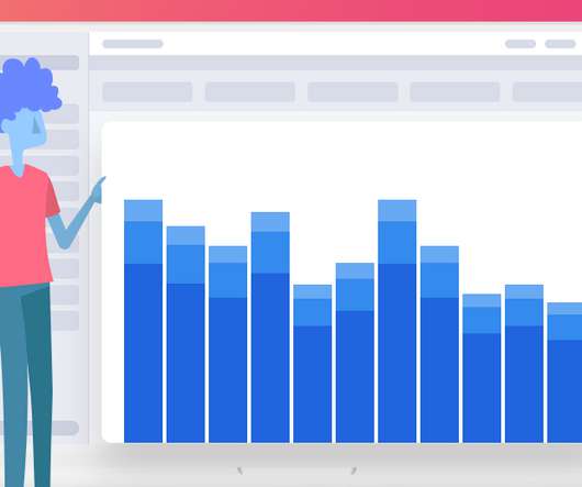
I've found across the many products I've managed that I ultimately end up developing at least three key dashboards that I review in detail every week. Those three dashboards are acquisition, engagement, and monetization. Those three dashboards are acquisition, engagement, and monetization. Acquisition. Engagement. Monetization.
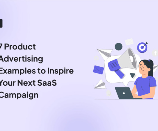
In this article, we’ll explore 7 product advertising examples to inspire you—from video ads and social media marketing to events and blogging. TL;DR Product and digital advertising come in different packages. Here are seven of the best advertising campaign examples in SaaS: 1. Buffer value-based advertising.
In marketing, they can gauge brand awareness, assess advertising effectiveness, or understand customer preferences. Real-time analysis helps respond to trends as they arise, with dashboards visualizing results for quick, data-driven decisions. These templates simplify the survey creation process and capture essential feedback.
In early 2018, I realized that I didn’t need to advertise my services, as I really didn’t have the spare time it would take to keep it fresh. I was getting pretty solid referrals from them (checking my Google Analytics dashboard). I should mention that a good post, referred by the BPMA got 40 to 50 views.
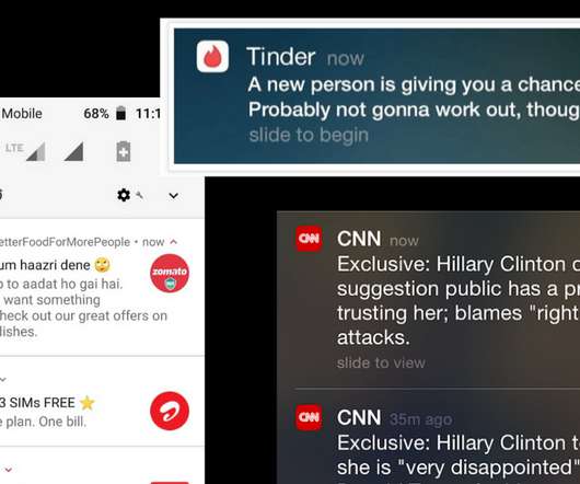
Advertisements are inescapable – they’re on the side of our bus to work, they’re in the magazine we’re reading, and they’re infiltrating our social media feeds, podcasts, and television shows. Depending on the output, the trailer can appear in different formats – from a one-page project overview to highlight reels, a dashboard, or designs.
A good example of the power of data is being shown by the product managers at Bacardi and Mercedes-Benz who have turned in part to a dashboard of analytics that has helped them to extend their product development definition. as the candy giant ramps up its advertising for the holiday season. How To Use The Data That You Have.
Just be sure to read the group’s terms and conditions and avoid any blatant advertising that will only do a disservice to you and your app. DESIGN A DASHBOARD FOR RECORDING AND ANALYZING YOUR METRICS AND KPIS. CONTINUE TO ADD TO YOUR PERFORMANCE DASHBOARD. IDENTIFY INFLUENCERS AND REPORTERS.
The user journey-from the first login screen to the advanced investment dashboard-must reflect the institutions identity. A disjointed experience-say, radically different functionality between a mobile app and desktop dashboard-can erode trust. Consistency as a Trust Builder: Trust is the cornerstone of financial services.
Google AdWords – advertising. Demandbase – advertising. The breadth of its platform is pretty breathtaking, with products that run the gamut from advertising, blogging, SEO, email, social media, call-to-actions and beyond. Alternatives: AdRoll, Quantcast. Alternatives: SalesLoft. Aircall – cloud calling.
Is your revenue coming from advertising, in-app purchases, a monthly subscription, or some combination of these? The mobile metrics here are more obvious, yet it’s still important to include them explicitly in your dashboard, so that you are always keeping your eye on achieving your business goals. Look at the Big Picture.
As I said, things get complicated as you attract more diverse customers, diverse use cases, different types of advertising campaigns, more and more people in the mix. They need to see: “Am I going to get the right dashboards out of this? So that’s today’s topic. It doesn’t mean that that’s a bad thing.
While he’s experimented with advertising on a few different platforms, he’s currently focusing his efforts on professional networking platform LinkedIn. Jess Knollmeyer is a Senior Product Designer at n0de , a company that’s developing software solutions to make net zero approval, planning, and implementation easier and faster.
When it comes to marketing analytics, the following features are useful: Dashboards – You can create custom analytics dashboards using templates or build them from scratch. These dashboards let you monitor and visualize core metrics , such as user activity, engagement, sentiment, and conversion rates.
Teams are getting creative with their notification campaigns Social media marketing, advertisements, AI-based recommendations, manual content curation, notifications, email campaigns and cross-promotion. Configuring a flag from the push notification dashboard is pretty simple. This, in turn, would increase the CTR and so the KPIs.
there are many ways to connect and organize metrics and dashboards. But let’s imagine an e-comm project is Amazon: then the 0.01% fluctuation will mean losing millions of dollars on digital advertising alone. Brainstorm Ask your team: What are the key metrics on our dashboards, reports, and ad-hoc calculations?
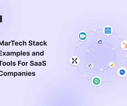
If you’re a digital marketer, nearly every year brings a new advertising channel to master, from Facebook and Twitter in the late 2000s to Snapchat and TikTok more recently. Just look at the world of marketing: there are now more than 7,000 tools , up from a mere 150 in 2011.
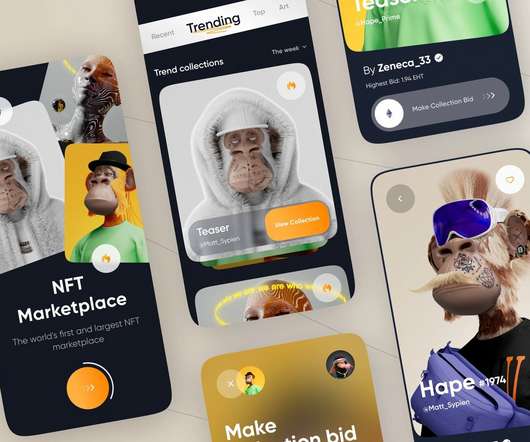
NFT dashboard/Storefront The NFT dashboard is a display for all the digital assets in the marketplace, open for the users to trade them. A number of the items accessible in the dashboard are the NFT price list, NFT description, NFT Categories, etc.
Free tools cost nothing and offer basic tools like event tracking , user segmentation, reporting features, dashboards , and visualizations, but are limited in data processing, lack customizations and technical support, and have no integrations with other apps. Advertising snapshot. Analytics dashboards. A/B testing.
An important criteria for choosing a quantitative SDK is the option to track KPIs on a custom dashboard. AdvertisingAdvertising SDKs allow you to monetize your app. Another factor that you should consider is the ad network of your advertising SDK. Quantitative data will give you an objective basis to work on.
Regular users don’t pay to use Facebook; only advertisers do. It only uses CAC when it acquires an advertiser. Another common mistake is to only consider advertising costs while calculating CAC. These sales and marketing expenses include more than just advertising costs. Geckoboard’s Dashboard. Geckoboard.
Endowed Progress with ‘My Stats’ As part of the user’s Profile section in the App, one gets to see a dashboard of statistics with prominence given to the current continuous streak. Let us unravel its persuasive elements one by one. Another interesting thing to note here is the lack of mechanisms to share the badges.
Unify your data to deliver better customer experiences : You can combine data using the flexible and customizable HubSpot marketing dashboards to see the initiatives that yield the best results for your business. Ads and Campaigns Ad campaign ID : populates the advertising campaign linked to the ad interaction.
Here are the key features to look for in an analytics tool: segmentation, tracking capabilities, A/B testing , and data visualization with analytics dashboards. HubSpot Marketing Hub is a robust automation platform that features content marketing, SEO, digital advertising, email marketing, social media, and analytics tools.
Analytics dashboards : Find essential adoption metrics, such as the number of active users , user sessions , average session duration, etc., You can also create custom dashboards using metrics of your choice. Userpilot’s analytics dashboards. GA dashboard. Mixpanel’s dashboard. HubSpot dashboard.
Review your advertisements, walk through the purchase experience, install and use the product, reach out for help via the support experience, read the documentation, etc. Your lack of familiarity with the company and market is an asset, but you will lose it very quickly!
User analytics: The custom analytics dashboard provides a centralized view of customer data, allowing you to segment, filter, and analyze user behavior. Analytics dashboard in Userpilot. Customization options Pendo provides limited customizations when building dashboards, creating surveys, or reporting customer data.
Some of its key features include: Custom dashboards : You can effortlessly create custom dashboards to track metrics relating to your in-app product marketing campaigns, such as feature adoption rates , activation rates , upsell rates, etc. Track product growth metrics with a custom Userpilot dashboard.
Modern tools recognize the importance of visual representation and offer interactive dashboards that display and allow you to interact with your data. These dashboards make complex datasets more digestible, converting them into graphs, charts, and plots that you can analyze easily. Get interactive dashboards with Userpilot.
Userpilot is an all-in-one growth platform that can assist you through the product development lifecycle with features like user feedback surveys, funnel analytics, analytics dashboards, and onboarding UI patterns. Features and events dashboard in Userpilot. Userpilot’s analytics dashboard.
After launching a new feature called “Activity Dashboard,” MINDBODY used a funnel analysis to see how the addition impacted their conversion goal: booking classes. They found that users who engaged with the Activity Dashboard had 24% more classes booked per week.
Team-level : Collect metrics that contribute to conversion metrics around the features you support (return on advertising spend, web to mobile conversions, trial to paid conversion). One way to bring these analyses together is through a comprehensive dashboard like the one below. Figure out the story you want to tell. Final Thoughts.
Custom analytics dashboards : Userpilot allows you to create custom analytics dashboards and monitor the core metrics essential for customer lifecycle management. Journey builder : This feature lets you design and automate customer journeys across multiple channels, including email, mobile, advertising, and web.
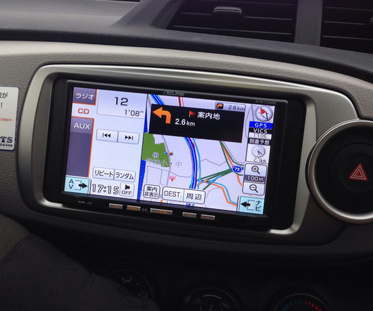
A battle is brewing for your car’s dashboard screen Image Credit: may bird If you think about it, all of the screens in your life have already been claimed by someone. It’s the screen that is on the dashboard of your car. Your PC screen is owned by either Microsoft or Apple. Your phone screen is owned by either Google or Apple.
Embedded analytics is everywhere around us – in our cars, in our homes, in our security systems, in the digital advertising that we see while surfing the web, and even in the healthcare services we are being treated with. Reveal Embedded Analytics. Legacy Infrastructure.
Unlike other channels with spam messages or advertisements, our app offered a focused environment where participants’ attention wasn’t divided. Analytics dashboards – to monitor important metrics and reports in visual dashboards. Using our product to recruit interview participants was a logical choice.
Think about how Slack targets senior operations staff or how HubSpot advertises its CRM software to upper management. The most common channels that SaaS companies use for B2B marketing include paid advertising, social media, email marketing, and content marketing. Implement full-funnel PPC.
Features & Events dashboard in Userpilot. Amplitude Analytics dashboard. Once you have your segments set, you can track the events that each of them completes to identify patterns in their behavior. Let’s imagine you have a scheduling app like Calendly. Its application used to be limited to websites only.
Mixpanel dashboard view. Access a detailed view of user analytics metrics and KPIs in customizable dashboards and reports. Real-time dashboard. Get access to an analytics dashboard to see how your pages perform and the results of your tests. This lets you improve the performance of advertising campaigns.
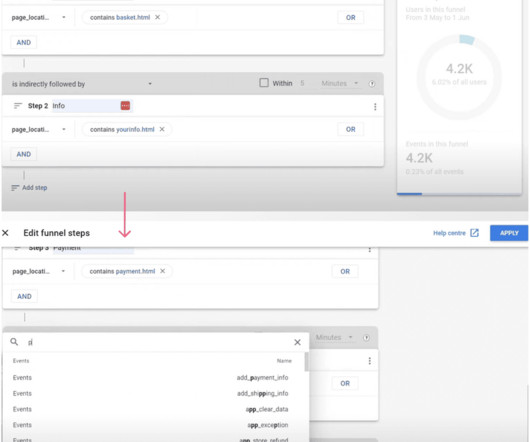
Setting up a funnel analytics dashboard in GA4 is similar to Heap in terms of setting up steps. It’s a popular tool for e-commerce businesses that focuses on tracking conversion and purchase-related data and leveraging such data for advertising purposes. Heap’s Event Visualizer. Configure funnel analysis in Google Analytics 4.
Delighted Dashboard. Multiple interactive survey templates, with 12 different question types As well as email, surveys are shareable via SMS, embed codes, web widgets, and even APIs Comprehensive analytics suite with multiple dashboards Multi-language support. Feedier Dashboard. Promoter Dashboard. Wootric Dashboard.
And instead of merging all of the new features like new project types, more sophisticated project settings, and different feedback analysis dashboards to the old interface and making it overwhelming. You can measure and calculate visual effects based on the number of additional clicks on advertisements and increased user engagement.
Airbnb doesn’t own properties, instead it has a platform for people to advertise and rent short-term accommodation. When someone has been staring at spreadsheets and dashboards for hours on end, they’re not motivated by the idea of creating that report you’ve asked them for.
Weekly active users (WAU) and Daily active users (DAU) on the UXCam Dashboard. Cart activity shown in dashboard from UXCam. Conversion break downs on dashboard from App Radar. Therefore, calculating the conversion rate via paid advertising will show you a paid conversion rate. Crashes over time on UXCam dashboard.
We organize all of the trending information in your field so you don't have to. Join 96,000+ users and stay up to date on the latest articles your peers are reading.
You know about us, now we want to get to know you!
Let's personalize your content
Let's get even more personalized
We recognize your account from another site in our network, please click 'Send Email' below to continue with verifying your account and setting a password.


Let's personalize your content