This site uses cookies to improve your experience. To help us insure we adhere to various privacy regulations, please select your country/region of residence. If you do not select a country, we will assume you are from the United States. Select your Cookie Settings or view our Privacy Policy and Terms of Use.
Cookie Settings
Cookies and similar technologies are used on this website for proper function of the website, for tracking performance analytics and for marketing purposes. We and some of our third-party providers may use cookie data for various purposes. Please review the cookie settings below and choose your preference.
Used for the proper function of the website
Used for monitoring website traffic and interactions
Cookie Settings
Cookies and similar technologies are used on this website for proper function of the website, for tracking performance analytics and for marketing purposes. We and some of our third-party providers may use cookie data for various purposes. Please review the cookie settings below and choose your preference.
Strictly Necessary: Used for the proper function of the website
Performance/Analytics: Used for monitoring website traffic and interactions
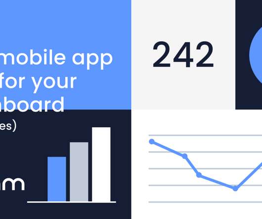
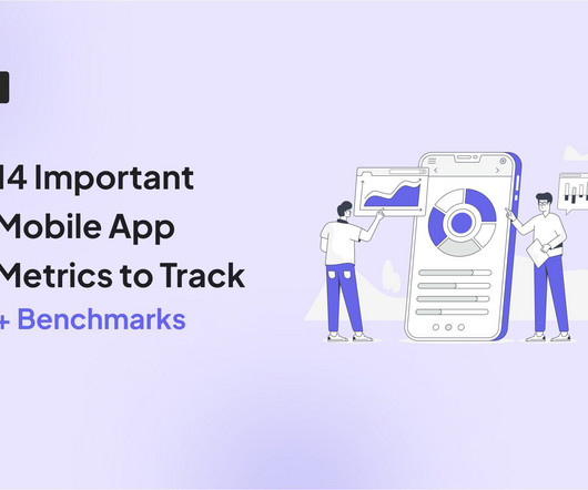
Learn about the importance of mobile app KPI dashboards and copy dashboards from real mobile app product managers, engineers and designers. A key performance indicator (KPI) dashboard is a visual representation of data that quantifies how well a team is performing towards its goals. How do I create a mobile app KPI dashboard?
In the retail industry, customer feedback is your early warning system, your innovation engine, and your most honest performance review. The following post references our new e-guide, The Retail Industrys Blueprint to Leveling Up CX . But this system only works if you take action on the feedback collected. Tie improvements to revenue.
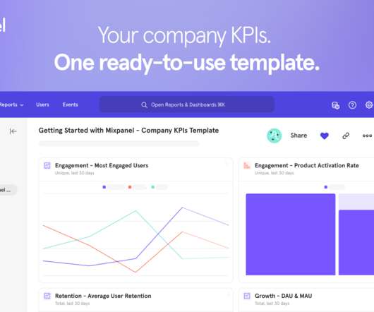
To take the guesswork out of measuring the right metrics, today we released the Company KPIs Dashboard template—nine out-of-the-box, fully customizable reports that make it easy for anyone to measure engagement, retention, and growth metrics. You need product analytics fast, and that’s where the Company KPIs Dashboard template can help.
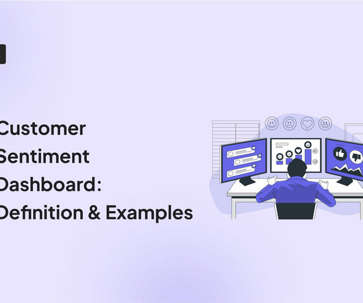
A customer sentiment dashboard is a great way to visualize customer feedback and see what users love (or hate) about your product. TL;DR A sentiment analysis dashboard typically integrates information from multiple data sources, such as social media posts, customer reviews, survey responses , and customer service chats.
Speaker: Daniel O'Sullivan, Product Designer, nCino and Jeff Hudock, Senior Product Manager, nCino
We’ve all seen the increasing industry trend of artificial intelligence and big data analytics. In a world of information overload, it's more important than ever to have a dashboard that provides data that's not only interesting but actually relevant and timely. Dashboard design do’s and don’ts. Where to start the journey.
One of these features you should look for is dashboard linking. The following article will delve into dashboard linking, its advantages, and potential benefits across various industries. What Is Dashboard Linking? How Does the Data Analysis Process Benefit from Dashboard Linking?
One of these features you should look for is dashboard linking. The following article will delve into dashboard linking, its advantages, and potential benefits across various industries. What Is Dashboard Linking? How Does the Data Analysis Process Benefit from Dashboard Linking?
Plus, the ability to create custom NPS dashboards allow you to analyze the results easily without writing a line of code. Get real-time access to customer feedback via a centralized dashboard that updates as responses come in. Visualize detailed reports with advanced data segmentation and dashboards.
Example: Imagine you’re designing a new dashboard for a fintech app. Example: For our dashboard, we might ask, “How might we create a dashboard that helps analysts quickly spot trends and take action?” Example: Imagine you’re designing a new dashboard for a fintech app. Big difference, right?
With the product usage dashboard, you can track user engagement metrics, popular pages and features, top interactions, trends, and even browser preferences. Know what you’re looking for before you start looking Dashboards have been a fad in the SaaS sphere for a while now. And the concept of diminishing returns sets in.
Problem Brief Over a span of 4 weeks, we tested Civians platform and created design solutions to improve the overall user experience of the dashboard. We also encouraged them to think out loud while they were navigating the dashboard, to help us uncover their mental model and identify hidden insights.
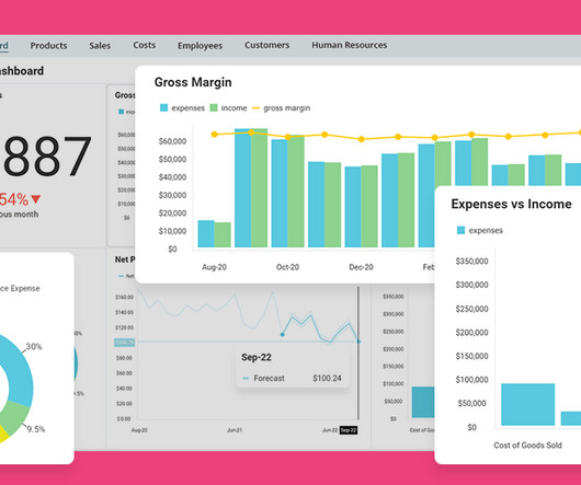
You can build your own custom charts and dashboards to see the metrics that matter in a single view, and access more of the data you need to measure team performance and improve operational efficiency. With custom reports, now you can track industry-standard metrics beyond pre-built dashboards. And that’s just the beginning.
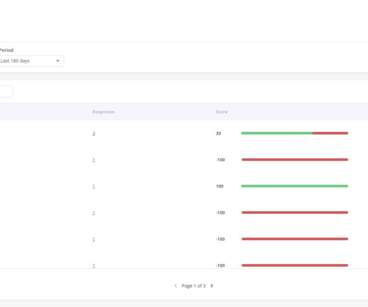
Wondering how an NPS dashboard can help you track customer loyalty? This is where the NPS dashboard comes in. Let’s see how the dashboard can help you extract insights from NPS responses and improve customer loyalty. What is the NPS dashboard? Why do you need an NPS dashboard?
This includes the business environment, any ongoing issues, industry understanding and benchmarking, etc. Dashboard : Customize the analytics dashboard or choose from pre-built ones to easily visualize and compare key metrics over time. To assign meaning to whether the numbers are good or bad, context is crucial.
Reference values CRR varies widely across industries due to differences in customer expectations about business. Here are some general reference values for CRR for different industries: Ecommerce: 25%40%. Chargebee dashboard for tracking customer behavior (and measuring retention).
Company details, like size or industry. Well, you can easily track the metrics from one of Userpilot’s analytics dashboards. There’s a ready-to-use Expansion Revenue & Upgrades dashboard, and you can create custom ones, too. Expansion Revenue & Upgrades dashboard in Userpilot.
E.g., Identify navigation issues in your analytics dashboard based on real-time user interactions. Userpilot is one answer, offering data collection and analytics features for quantitative and qualitative data, along with a custom analytics dashboard for visualizing your unique data and responses.
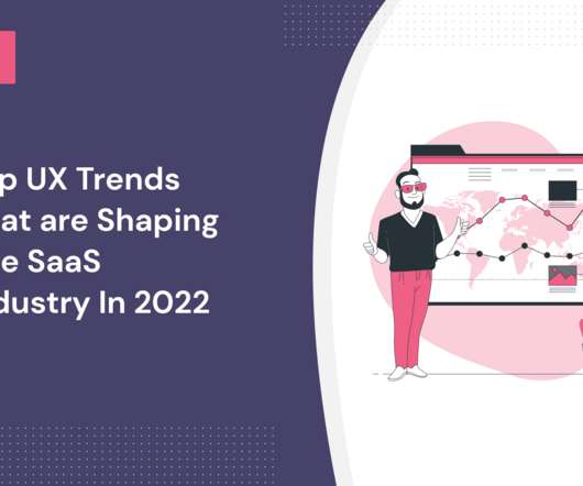
What UX trends are shaping the SaaS industry in 2022? A UX design trend is a development or movement in the UX design industry caused by a change in user behavior or the adoption of new technologies. Helps you understand the direction of the market: Design trends help you identify changes in your industry and prepare accordingly.
The user journey-from the first login screen to the advanced investment dashboard-must reflect the institutions identity. A disjointed experience-say, radically different functionality between a mobile app and desktop dashboard-can erode trust. Consistency as a Trust Builder: Trust is the cornerstone of financial services.
The insurance industry falls under one of those sectors that are undergoing rapid digital transformation. But given the fact that this industry demands different touchpoints for its clients, it is only appropriate for insurance companies to make their services more accessible and in turn, keep track of their customers via mobile apps.
But as we progressed in our customer discovery, we were able to refine our target audience hypothesis significantly by tightening the definition of our best customer to B2B sales professionals in large enterprises in the technology and financial services industries working in account executive or sales development roles.
Overcomplicated process of registering biometrics With the increasing usage of biometric technology in the fintech industry, consumers get better experiences and reach their aims faster. To increase working efficiency, users can tweak dashboards and choose the most topical tabs. And here’s when UX testing steps in.
These questions can be answered by a familiar model – that which the film industry has used to support movie releases for decades. Here, we’ll dive into the ways we can apply the film industry’s tried and tested model to future projects. Translating film industry phases to tech. Screening: Share early and often.
It turns out it was over 35 forms that were riddled with conditional logic, a redundant backend ticketing system, several dashboard views and needed to cater to a myriad of job functions. I initially thought ticketing was made of a few components, a couple forms and one or two workflows. Better Decisions. Better Products.
Multiple industries are suddenly forced to move operations online, and support teams are at the forefront of this transformation – battling every day to deliver excellent, fast customer service, while facing an unprecedented volume of enquiries and issues. Reporting upgrades.
Industry Stat: 57% of companies report significant improvements in product performance after adopting product analytics. Real-World Example If product analytics shows a high abandonment rate during a workflow, you might embed a dashboard or visualization that makes the workflow clearer. Why Is Product Analytics Important?
Visitors were bouncing off the homepage faster than a beach ball at a summer party, with conversion rates embarrassingly below the industry mark of 1.4%, which our friends over at Littledata pegged as average for eCommerce sites. Yes, you heard right75%. So, what does this translate into in tangible figures?
Our SDK is instrumented into mParticle, and when a mParticle customer decides to leverage Apptentive, a switch is flipped on in their dashboard which gives them immediate access to Apptentive. Tillster is the global leader in customer engagement programs and self-service ordering for the quick service restaurant and casual dining industries.
Analytics Which platform gives teams the clearest insights without drowning them in dashboards? Its the self-serve analytics platform that transforms raw numbers into intuitive dashboards. The platforms real-time performance dashboards highlight not just whats happening, but why its happeningso you can course-correct on the fly.
Analytics Which platform gives teams the clearest insights without drowning them in dashboards? Its the self-serve analytics platform that transforms raw numbers into intuitive dashboards. The platforms real-time performance dashboards highlight not just whats happening, but why its happeningso you can course-correct on the fly.
By David Roberts, CEO, Alchemer Today, Alchemer releases a product that changes the CX industry – Alchemer Workflow. From the day I arrived at Alchemer, I have thought about how the industry moves beyond simple surveys and simple analysis. Mostly, these dashboards have not moved the needle in the organization they serve.
Factors I consider when evaluating customer analytics tools Important core features Analytics dashboards : Provide real-time visualizations of key performance indicators (like active users and page views) at a glance, so you can easily track changes. Example of a Userpilot dashboard showing free trial to paid user conversion rate.
Given the creative industry that we’re in, this is only natural. I think a data visualization dashboard would be great as a first screen in the back-office.”. The original request was to ‘add a data visualization dashboard as a first screen on the product’. This is a long piece, so take your time or save it for later.).
Leaders across industries are recognizing this and moving fast to prioritize data democratizationensuring data is accessible to everyoneas a foundation of their SaaS development. Visualization: Presenting data through intuitive charts, dashboards, or reports. How is this possible?
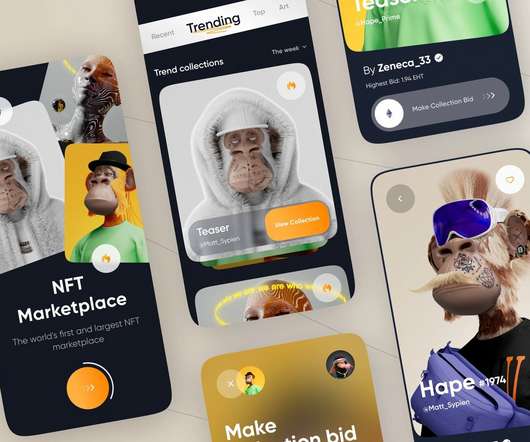
NFTs are crypto assets that assign ownership to their creators and apply to almost every industry these days. Let me give you a quick overview of these NFT marketplaces for new crypto members entering the industry. All blockchains in the industry have some standardized features that are fundamental to a user-friendly marketplace.
We also included industry benchmarks to help you know how well youre performing! A platform like Userpilot allows you to create custom dashboards and measure only the metrics that relate to your goals. Benchmark: Mixpanels 2024 benchmark report found the average stickiness across industries to be 37%. – Aakash Gupta.
Explore the Benefits of Customizable Dashboards for Greater Alignment and Transparency Roadmaps drive alignment, transparency, and strategic decision-making across product teams. As a central hub for planning and execution, they enable product managers to visualize goals, track progress, and communicate updates effectively.
It’s also important to be able to quickly and efficiently track how your team is performing against key metrics , so you know whether you’re on par with industry standards and delivering the high-quality experience your customers expect. Look for something with customizable, visual dashboards that allow you to create custom reports.
Dashboards of user behavior summarizing trends. Usage dashboards are maps that influence what we measure but also how we iterate. We’ve all seen the over-excited PM with his vanity metrics dashboard. You wouldn’t launch a new product without a cohesive set of logs and dashboards to measure success. Tell the truth.
Leveraging product analytics isnt just about making pretty dashboards; its about viewing your existing data as a learning opportunity to make informed decisions with your onboarding strategy. At Userpilot, we create quarterly dashboards organized by release. These dashboards dont just collect numbers; they tell a story.
Fareed believes we are going through another revolutionary shift akin to the industrial revolution – it’s a shift that means a significant change for digital products and the role of the product manager is evolving.
. “First developed in 2001 by Fred Reichheld, NPS quickly became a key metric in all sorts of industries, an agreed measure of customer loyalty” First developed in 2001 by management consultant Fred Reichheld, NPS quickly became a key metric in all sorts of industries, an agreed measure of customer loyalty.
The video game industry is evolving at a rapid pace, which puts pressure on gaming companies to perform. One of the most impactful steps that your company can take is to create a shared dashboard that connects employees across your organization to a single source of truth. Predictive Analytics in the Gaming Industry .
However, I can certainly think of product or marketing professionals who use the term value when referring to cheap widgety dashboards and features aimed at novelty seekers, or following an industry trend with no real vision. I’ve used flashier tools, but I get lost in the cheap widgety dashboards and I return to Atlassian tools.
We organize all of the trending information in your field so you don't have to. Join 96,000+ users and stay up to date on the latest articles your peers are reading.
You know about us, now we want to get to know you!
Let's personalize your content
Let's get even more personalized
We recognize your account from another site in our network, please click 'Send Email' below to continue with verifying your account and setting a password.


Let's personalize your content