This site uses cookies to improve your experience. To help us insure we adhere to various privacy regulations, please select your country/region of residence. If you do not select a country, we will assume you are from the United States. Select your Cookie Settings or view our Privacy Policy and Terms of Use.
Cookie Settings
Cookies and similar technologies are used on this website for proper function of the website, for tracking performance analytics and for marketing purposes. We and some of our third-party providers may use cookie data for various purposes. Please review the cookie settings below and choose your preference.
Used for the proper function of the website
Used for monitoring website traffic and interactions
Cookie Settings
Cookies and similar technologies are used on this website for proper function of the website, for tracking performance analytics and for marketing purposes. We and some of our third-party providers may use cookie data for various purposes. Please review the cookie settings below and choose your preference.
Strictly Necessary: Used for the proper function of the website
Performance/Analytics: Used for monitoring website traffic and interactions
Because we’re still treating product delivery like a cataloging exercise — build the system, then arrange everything into folders and flows. They assume the solution is always an app, a dashboard, or a full-screen interface. What surfaces, UI, interaction modality would be needed. Don’t assume full-screen flows.
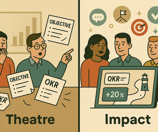
But too often, we see the signs of “OKR theatre”: Objectives so broad they could belong to any company Key Results focused on activity, not impact Teams forgetting their OKRs by week three Quarterly reviews that feel like report cards, not course corrections Instead of driving clarity and momentum, OKRs become a tick-box exercise.
Userpilot analytics dashboards can help you add relevant metrics and keep an eye on any changes that may occur. Userpilots Analytics dashboards. Elevate (Brain training app) Elevate keeps me practising brain-training exercises with the same psychology, but layers on skill progress. Example of Streaks showing a progress report.
This is not just a design exercise; its the essence of building long-term trust, loyalty and engagement. The user journey-from the first login screen to the advanced investment dashboard-must reflect the institutions identity. Each of these touchpoints becomes a stage on which the brands identity must shine consistently.
Language Dashboard Mobile App by Conceptzilla Learning app designtrends Apart from psychology and gamification, you can leverage the latest trends. Focus on well-being: Include features like mindfulness exercises, breaks, and feedback on user stress levels to contribute to a holistic learning experience.
Data Visualization & Dashboarding Data storytelling is a core part of communicating your insights. Candidates must know how to build and explain dashboards using tools like Tableau, Power BI, or Looker. How would you redesign a cluttered dashboard to make it stakeholder-friendly? Who was it for, and what did it help them do?”
That’s where investing time and energy into building an operations dashboard will pay dividend for years to come. What is a product operations dashboard? What is a product operations dashboard? A product operations dashboard is not a report. What KPIs should I track on my dashboard? making a purchase)?
Too often companies say they are data-driven but when I actually look inside to see how teams are operating, I hear anecdotes like the following: "I look at dashboards when I get a chance, but there is so much going on that I'm not looking at them regularly." "I The best place to start is not by just throwing together a dashboard of metrics.
DESIGN WORKBOOKS How to put design theory into practice in an efficient way My favorite UX design workbooks: develop your skills by solving exercises Learning design theory is a good step towards becoming a better designer, but it is also important to put the things you’ve learned into practice.
Execution: Metrics Dashboards. The best product managers look at a consistent set of metric dashboards on a daily and weekly basis to keep an active pulse on the product, but also to build their intuition for the natural ebbs and flows of their product metrics. Design: Product Roadmap.
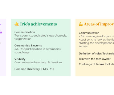
Former Staff UX Designer Maureen Rodaro was also key to implementing and evangelizing this type of exercise and a driving force behind pairing product managers and designers. Going through this exercise also revealed that some tasks are in between roles. This means that each trio can adjust the RACI to their own experiences.
To prepare for the workshop, Tali created a fictional case study, and with the help of ChatGPT, she generated six interview snapshots and some analytics dashboards. That exercise helped us sharpen our prioritization and give more nuance to the general idea that we should ‘improve the user experience.’”
This data-driven approach permeates events, dashboards, metrics, and reports, and leaves most of us feeling less like Neo at the end of The Matrix and more like a dog whose owner just hid a tennis ball after pretending to throw it – confused, our excitement transmuted into frustration so deep we feel like chewing on our favorite plush toy.
To help hiring managers and recruiters, like myself, decide whether or not to interview you, it can be a great exercise to treat your resume like a professional product. Did you install analytics or build dashboards? Here I’ll share some useful pointers on how to do just that. Tell us about it. Iterate and Refine.
While many of his ideas naturally appeal to those seeking to develop lifestyle habits like exercising, losing weight, or quitting smoking, I found his ideas to be equally relevant for product managers looking to accelerate their career. Maybe as part of that ritual, that's the time you take to review your daily dashboards.
But what exactly is a product operations dashboard? What is a Product Ops Dashboard? A product operations dashboard provides a visual way to track a subset of KPIs. How to Build a Product Ops Dashboard. Your dashboard will only be as good as the data that fuels it. Ready to build one of your own? transaction speed.
Hence roadmapping is a crucial exercise which can make or break your product. Note: It would be hard to track and then follow up engineers to update the JIRA if not in standups Proper dashboarding and reporting to be done in JIRA so that required stakeholders are informed of the progress on a regular basis – at least on a weekly basis.
That’s where having an operational dashboard that provides “real-time” view of key KPIs is critical to ensure you are making product decisions that align with your users and business goals. Once you have a solution to a problem (i.e., early and late adopters).
They also have dedicated focus for improving sleep quality and iPad version of their App also includes guided physical training exercises. Endowed Progress with ‘My Stats’ As part of the user’s Profile section in the App, one gets to see a dashboard of statistics with prominence given to the current continuous streak.
file extracts, reports, and an interactive dashboard. Simple changes included designing the extract to be in their format eliminating transformation requirements, sending reports formatted in the order they expected to use them in their process, and configuring the dashboard to be a link in the relevant workflow as opposed to a separate site.
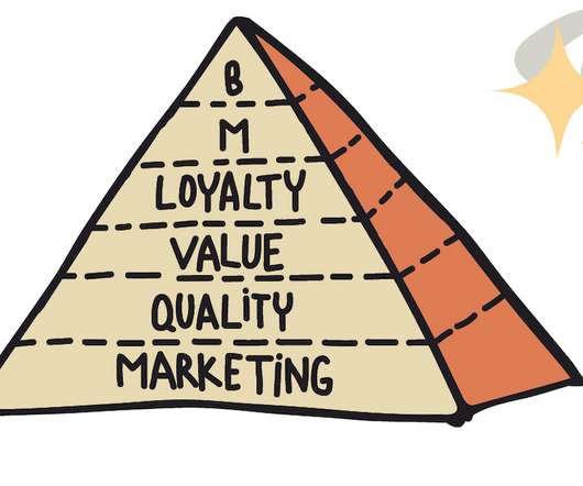
there are many ways to connect and organize metrics and dashboards. A hierarchy built this way is just a mental exercise. Brainstorm Ask your team: What are the key metrics on our dashboards, reports, and ad-hoc calculations? Metrics Pyramid, Metrics Hierarchy, Unit Economy, Funnels?—?there Let’s see how it works.
The big difference is with the live chat funnel, you do this in real-time, which requires sales teams to exercise a few new muscles. Here’s an example of how that might be done: Sales managers, be sure to adjust your dashboards and KPIs to account for real-time metrics, such as first response time.
Analytics dashboard for a comprehensive view of all key stats. The data-driven insights from this exercise ensure updates solve real problems and contribute significantly to the product's value proposition. A detailed data analytics dashboard gives you access to real-time data, so you’re able to draw fresh insights every time.
Data visualization, for example in a dashboard, aids in its interpretation and trend tracking. It’s good practice to visualize all the data collected for a particular purpose in one dashboard. Data-driven analytics: new user activation dashboard in Userpilot. The testing isn’t a one-off exercise.
This prediction is sent to the user via a dashboard or other user paradigms. Simple exercises to try out this framework include Here are few examples of models you can practice using this framework. New data comes in and this data is passed on to the model and the model spits out predictions. Does this machine need maintenance?
The product was initially called the Startup Grind Dashboard. Turns out that as the Startup Grind Dashboard continued to evolve and become more robust to support Startup Grind’s community management needs, the Startup Grind leadership team realized the product might be able to be used by other organizations to manage their communities.
By owning your data, you can exercise greater control over how it’s stored and used. Google Analytics events dashboard. HubSpot dashboard. Because first-party data is gathered from your own channels, you’ll end up with relevant insights. Greater ownership.
We can self-track the way we eat, sleep, breathe, exercise, work and yup, we can even journal our bowel movements. Bring users right to their dashboard where they can see their current status and the data they want most. We’ll talk about good dashboard design a bit later below). So what makes a good data dashboard?
Delighted Dashboard. Multiple interactive survey templates, with 12 different question types As well as email, surveys are shareable via SMS, embed codes, web widgets, and even APIs Comprehensive analytics suite with multiple dashboards Multi-language support. Feedier Dashboard. Promoter Dashboard. Wootric Dashboard.
Writing up the press release for your theoretical new feature can be a helpful exercise here. This is crucial because it determines how we might position and market that feature, how we enable our sales team, and so on. Also, heavily use View Users to reach out to power users and get feedback/ customer stories for marketing content.
They don’t just crunch numbers; they translate their findings into clear and compelling stories through reports, dashboards, and presentations. BI Analyst (3-5 Years) : You’ll take on more responsibility for independent data analysis, report creation, and dashboard development.
Dashboards via Team Spaces will be the single most important way to make sure your team is data-informed. Reports such as Pathfinder, Event Segmentation, Funnel Analysis and Lifecycle should be included in these dashboards. During Design Thinking exercises. How to leverage Amplitude for data-informed requests. Limitations.
A useful exercise in understanding the outcomes of a modern-day business, particularly in Silicon Valley, is to examine companies in this way. When someone has been staring at spreadsheets and dashboards for hours on end, they’re not motivated by the idea of creating that report you’ve asked them for.
Understanding the memory laws isn’t just an academic exercise; it’s a crucial skill that can elevate your designs and keep users engaged. Minimized cognitive load in Real Estate Dashboard Design Concept by Conceptzilla Chunking Information It is a way of organizing data into smaller, more manageable pieces or “chunks.”
You might also be interested in Mobile app KPI dashboard examples and how to use them What is customer retention and why is it so important? Building products that are long-lasting and retain users is truly a challenging exercise. So what now?
Or they’ll argue that one group needs to “decide and agree on the KPIs and what they need to see on dashboards” and THEN, some other group goes off and does the work. Try a customer journey mapping (or similar) exercise to explore the customer narrative. And that engagement creates ownership!”. Experiment with mixing up approaches.
The takeaway : Listening and speaking skills are the focus of this exercise. With your digital dashboard, the team works together to find clues and solve puzzles. Gather the group together, then ask each person in the group to discuss a leader they admire, and why. Tallest Tower. Tools : Abstract items for building a tower.
With at least 830 vendors in the space and more being added daily, building your tech stack can quickly become an overwhelming exercise, even for the most experienced of us in sales operations. Use DocSend to send case studies, presentations and other content – and then track prospect engagement in its dashboard. Outreach.io.
In the past, although Atlassian products offered great in-product dashboards, many teams struggled to build cross-platform custom reports because it required a deep understanding of APIs and scripts. Atlassian Data Lake will simplify custom dashboards, reporting, and analysis.
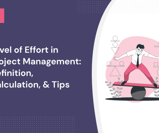
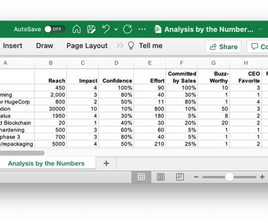
Assign values to your level of effort scale Based on the outcomes of the estimation exercises, you next assign the effort value to each task. Asana dashboard. Relative – used in Agile frameworks to estimate the story points by comparing the effort of all tasks to one another. Level of effort estimation: the Delphi technique.
Creating revenue estimates for usability or validation experiments or dashboards is mostly IMO wasted effort. Sound Byte Prioritization is more than an analytical/intellectual exercise. It's Our semi-arbitrary inputs don't improve much with ever-deeper analysis.
And you’re telling me you don’t have guidelines for how to conduct interviews, analysis exercises, and communicate findings? It is easy to set up, for example on a customer dashboard, and configure it up to automatically ask people logging in if they would be interested in participating in user research in the future.
They articulate the value of the product and make it compelling to prospects through messaging and positioning exercises. Editor’s note : Speaking of performance metrics, product managers and product marketers can visualize important KPIs on Userpilot’s analytics dashboards. Product usage dashboard in Userpilot.
Creating a user persona is not a set-it-and-forget-it exercise. Your user would be interacting with your app on a large desktop screen, capable of clearly displaying your app’s entire dashboard. Users’ needs change. Their companies’ priorities evolve. The last couple of years has given us significant examples of changes like these.
We organize all of the trending information in your field so you don't have to. Join 96,000+ users and stay up to date on the latest articles your peers are reading.
You know about us, now we want to get to know you!
Let's personalize your content
Let's get even more personalized
We recognize your account from another site in our network, please click 'Send Email' below to continue with verifying your account and setting a password.


Let's personalize your content