This site uses cookies to improve your experience. To help us insure we adhere to various privacy regulations, please select your country/region of residence. If you do not select a country, we will assume you are from the United States. Select your Cookie Settings or view our Privacy Policy and Terms of Use.
Cookie Settings
Cookies and similar technologies are used on this website for proper function of the website, for tracking performance analytics and for marketing purposes. We and some of our third-party providers may use cookie data for various purposes. Please review the cookie settings below and choose your preference.
Used for the proper function of the website
Used for monitoring website traffic and interactions
Cookie Settings
Cookies and similar technologies are used on this website for proper function of the website, for tracking performance analytics and for marketing purposes. We and some of our third-party providers may use cookie data for various purposes. Please review the cookie settings below and choose your preference.
Strictly Necessary: Used for the proper function of the website
Performance/Analytics: Used for monitoring website traffic and interactions
How Rumi Cosmetiques Boosted UserExperience and Conversion Rates in eCommerce: A Case Study for Marketers andManagers Discover how Rumi Cosmetiques achieved a 75% increase in cart adds and doubled conversion rates by enhancing userexperience and conversion rate in eCommerce.
Reveal Embedded Analytics We know how difficult it is to create dashboards, especially for web applications. Thats what dashboards are for. They track everything from user behavior to system performance. In fact, Angular dashboards can provide key insights that will eventually allow data-driven decision-making at your company.
Instead of trying to eliminate these biases, a neuroscientific approach harnesses them for goodgently guiding users toward better decisions through well-timed nudges and simplified choices. It is also counterintuitive to think that less information might actually benefit users. In fact, sometimes less really is more.
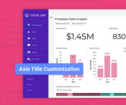
Flexible Chart Legend Positioning: Move and align legends for better dashboard design. Improved Usability: Quickly find and analyze key information. is Here: Smarter Analytics, More Control, Better UserExperience and written by Casey McGuigan. Smarter Numeric Axis Labeling: Reduce label clutter and improve readability.
But today, dashboards and visualizations have become table stakes. Think your customers will pay more for data visualizations in your application? Five years ago they may have. Discover which features will differentiate your application and maximize the ROI of your embedded analytics. Brought to you by Logi Analytics.
Introduction to customer satisfaction surveys Customer satisfaction surveys are vital tools for understanding what customers think, feel, and experience. This information empowers teams across your company to make informed decisions based on customer experiences and perceptions.
Unfortunately, the research backs this up, with a staggering 90% of users reporting that they stopped using an app due to poor performance. Basically, anything that ruins the userexperience. It helps get a better understanding of user pain points and uncover improvement areas for enhancing the overall userexperience.
Your customer information lives in Salesforce, while your support tickets are in Zendesk, your product usage data in Mixpanel, and your marketing campaigns in HubSpot. Data fragmentation prevents you from delivering the cohesive, personalized experiences your customers expect. But that view only reflects web users.
As today’s user increasingly desires swift solutions when using digital products, userexperience optimization can spell the difference between the success and failure of a product. To retain users, continuous improvement of your UX optimization efforts is critical. Analyze the collected data and prioritize changes.
A customer sentiment dashboard is a great way to visualize customer feedback and see what users love (or hate) about your product. TL;DR A sentiment analysis dashboard typically integrates information from multiple data sources, such as social media posts, customer reviews, survey responses , and customer service chats.
Why product analytics fails The ongoing process of tracking analytics is riddled with errors and roadblocks that prevent teams from making informed decisions. There are three main culprits as to why: Inefficiency : Companies might use many product analytics tools to track monthly active users.
Choose UX research tools with essential features , collaboration, reliable support , user-friendliness, scalability , integrations , and strong security. Userpilot enhances userexperience through in-depth UX research, offering features to gather, analyze, and act on customer feedback.
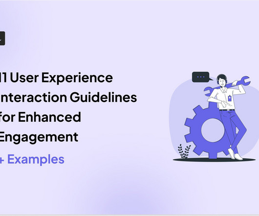
Alongside usability testing, userexperience interface guidelines allow you to build more intuitive and user-friendly solutions. In this blog, we explain eleven userexperience and interaction design guidelines supported by real-life examples to improve product engagement. System status visibility.
Would you like to learn how to design a SaaS metrics dashboard for your team without any coding? In the article, you will find examples of various SaaS dashboards and learn how to create them with Userpilot analytics. If so, you're in the right place! Let's dive in, shall we? Let's dive in, shall we? To name just a few.
Userexperience analytics is one of the secret ingredients for boosting SaaS growth. This ensures your product remains enjoyable for users, boosting retention and loyalty. This data type identifies the “what” of a userexperience problem. What is userexperience analytics? across the customer journey.
It tracks key metrics such as feature usage , user flows, and behavior patterns to explore user preferences and pain points. A product analytics strategy is essential for any business looking to make informed decisions about product development and userexperience. Why should you have a product analytics strategy?
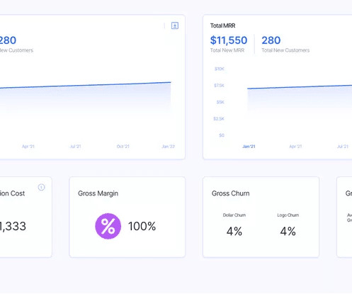
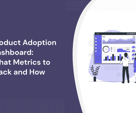
A product adoption dashboard helps you visualize key adoption metrics so you can make data-driven decisions and boost user engagement. In this article, we cover the following: Why you need a product adoption dashboard. Steps to measure adoption using a comprehensive dashboard. Understand how users adopt new features.
They may be able to provide qualitative insights , but there was no way to quantify their interactions with the product, which is essential for informed decision-making. – Isa Olsson, UX Researcher and Designer at Zoezi Finally, Zoezi users had no easy way to report issues from within the product. . They like being informed.
Functionality is a must when it comes to attracting customers, but it’s userexperience that helps you retain them. Wondering how to create an outstanding userexperience ? TL;DR UX design identifies user needs, wants, and pain points and creates engaging products that enable them to achieve their goals.
The solution might lie in your ability to create a comprehensive userexperience map. A well-crafted userexperience map can be your secret weapon for understanding customers, identifying pain points, and boosting product engagement. We also identify some best practices to follow when creating the userexperience map.
They communicate changes, fixes, additional features, and upgrades associated with the new release and provide key information (if required) to help users navigate the latest updates. Sunsetted features : Focused on features or services being retired, these notes informusers about timelines and provide alternatives.
Without a strong and consistent digital brand, financial institutions risk being overshadowed by nimble Fintech startups or tech giants like Apple and Google that excel in userexperience. A strong digital brandensures: Customer Loyalty: A seamless and intuitive digital experience keeps customers engaged. million to 91.7
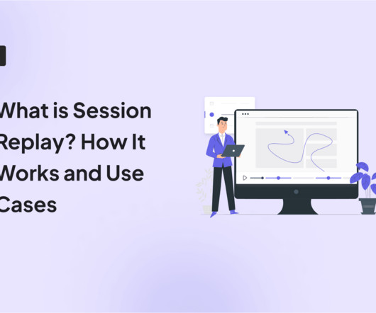
This powerful tool allows you to see your website or web app through your users’ eyes. It reveals the “why” behind their actions and unlocks valuable insights to improve the userexperience. Conversely, session replays don’t actually record a user’s screen in the traditional sense.
Why embedded analytics adds value to your data strategy The difference between product analytics and embedded analytics Without data-driven insights, your product risks falling behind competitors who make better-informed decisions. Product analytics gives you the information needed to make smarter, faster decisions.
The problem lies in the ill-conceived UX, as users don’t receive information about the current action performed by the system and the time it takes. Thus, by simply providing text messages containing a brief process overview, it’s possible to warn users and make them stay. And here’s when UX testing steps in.
They track 47 different key performance indicators (KPIs) in their mobile analytics platform , spend hours debating dashboard numbers, yet can’t predict which users will churn next week The problem here isn’t a lack of data. A user abandoning signup and completing it 3 days later doesnt signal a UX issue.
Much of the literature that defines the role as the intersection of business, technology, and userexperience isn't particularly helpful for practitioners who are left wondering what skills they need to learn versus the fine people they work closely with in actual business, technology, and userexperience roles.
All too often it’s the latter, because they weren’t built to provide a delightful experience. Expectations around userexperience are higher than ever – therefore we need fast and impactful tools. We believe that in the future, the experience of the tools we use at work will be indistinguishable from our personal life.
Mobile app tracking captures data on how users interact with your app, including actions such as screen views, button taps, session length, and feature usage. For example, say a user opens your app, skips the onboarding tutorial , and heads straight to the dashboard. Only to lose interest and leave without using any key feature.
One look at your mobile app analytics dashboard, and you just want to shut your eyes and scream in frustration. You aim to extract meaningful insights to improve app performance and user engagement. Prioritize metrics that answer specific questions Avoid looking at vanity metrics that dont inform your next move.
Once the user completes verification, they are guided through a short welcome survey that gathers critical information like the user’s role, goals, and company details. Now, this onboarding flow works well because Miro is a highly visual tool that doesn’t need much information to onboard users, nor has a long sales cycle.
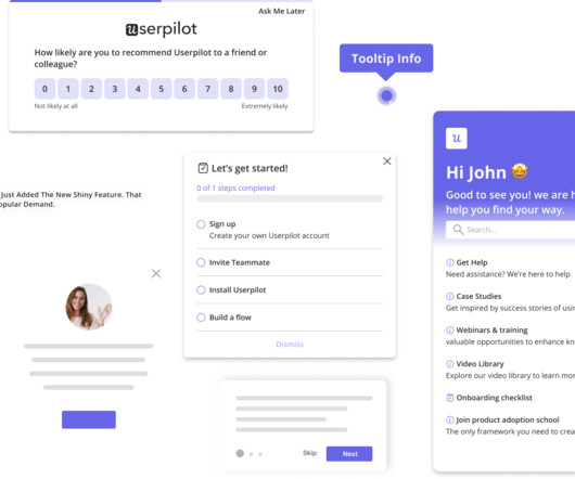
Companies already using Whatfix for web For teams already leveraging Whatfix on desktop, extending that functionality to mobile ensures a consistent userexperience across platforms. With a shared dashboard and content strategy, you can manage flows, tooltips, and updates without duplicating effort.
Incorporating these tools into your customer experience tech stack will drive more engagement, gather high-quality customer feedback, and help inform your product roadmap. To help you with this, we compiled a list of the top mobile in-app feedback tools of 2021. Mobile in-app feedback tools & solutions.
Image by ar130405 from Pixabay Test management tools are utilized to save information on the ways testing is done, plan testing activities and tell the status of the quality assurance activities. This provides you with a fast, flexible, and strong userexperience.
Fast and personal messenger-based conversational support tools that offer a high-quality, delightful customer experience, but which can lack the underlying flexibility to accommodate the complexities of every type of business. More powerful Inbox. . Reporting upgrades.
1 Engagement DAU/MAU Understand daily and monthly active user engagement and overall app popularity. 2 Engagement Feature adoption Gauge user interest in new features and optimize feature development. 3 Engagement Average user session length Measure user interactions and identify areas for improved content or flow.
Well, you hit two birds with one stone, significantly enhancing both the userexperience and the overall effectiveness of the learningprocess. Here are some key advantages: Improved user engagement: A well-designed application captures users attention and keeps them engaged.
Usability testing: Observe users as they interact with your product to identify usability issues and collect feedback on userexperience. E.g., Identify navigation issues in your analytics dashboard based on real-time user interactions. Survey results dashboard in SurveyMonkey.
This information will also be useful for those with a complex and sophisticated product, helping them to make it easier to understand and to reduce the users cognitive load. Whereas conventional websites may focus on visual aesthetics, SaaS is built around productivity and solving user problems.
Tali was so excited to share her experience with opportunity solution trees, she led a workshop at UXDX in Dublin. To prepare for the workshop, Tali created a fictional case study, and with the help of ChatGPT, she generated six interview snapshots and some analytics dashboards.
Incorporating these tools into your customer experience tech stack will drive more engagement, gather high-quality customer feedback, and help inform your product roadmap. To help you with this, we compiled a list of the top mobile in-app feedback tools of 2022. Mobile in-app feedback tools & solutions.
Factors I consider when evaluating customer analytics tools Important core features Analytics dashboards : Provide real-time visualizations of key performance indicators (like active users and page views) at a glance, so you can easily track changes. Example of a Userpilot dashboard showing free trial to paid user conversion rate.
The faster potential users understand how valuable your app is to their lives, the more likely they are to become frequent users and, better yet, paying customers. Effective onboarding is also necessary to set your users up to use your app successfully. This can be done by collecting documentation like a Passport or ID card.
We’ve handpicked the top 5 product lifecycle management solutions to help you make an informed decision. Pendo works well to help you optimize product experience. Userpilot helps you with product-led growth by providing actionable insights and personalized userexperiences. Userpilot dashboard. Pendo dashboard.
We organize all of the trending information in your field so you don't have to. Join 96,000+ users and stay up to date on the latest articles your peers are reading.
You know about us, now we want to get to know you!
Let's personalize your content
Let's get even more personalized
We recognize your account from another site in our network, please click 'Send Email' below to continue with verifying your account and setting a password.


Let's personalize your content