This site uses cookies to improve your experience. To help us insure we adhere to various privacy regulations, please select your country/region of residence. If you do not select a country, we will assume you are from the United States. Select your Cookie Settings or view our Privacy Policy and Terms of Use.
Cookie Settings
Cookies and similar technologies are used on this website for proper function of the website, for tracking performance analytics and for marketing purposes. We and some of our third-party providers may use cookie data for various purposes. Please review the cookie settings below and choose your preference.
Used for the proper function of the website
Used for monitoring website traffic and interactions
Cookie Settings
Cookies and similar technologies are used on this website for proper function of the website, for tracking performance analytics and for marketing purposes. We and some of our third-party providers may use cookie data for various purposes. Please review the cookie settings below and choose your preference.
Strictly Necessary: Used for the proper function of the website
Performance/Analytics: Used for monitoring website traffic and interactions
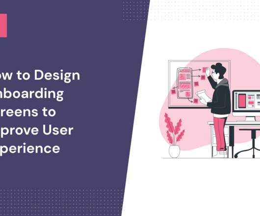
How Rumi Cosmetiques Boosted UserExperience and Conversion Rates in eCommerce: A Case Study for Marketers andManagers Discover how Rumi Cosmetiques achieved a 75% increase in cart adds and doubled conversion rates by enhancing userexperience and conversion rate in eCommerce.
For example, instead of merely presenting numbers, we can incorporate storytelling into the userexperience, transforming each financial action into a personal goalsuch as saving for a vacation or a childs educationmaking the experience more relatable and motivating. In fact, sometimes less really is more.
Website feedback and online surveys : These collect opinions about digital experiences, focusing on usability and content quality. Businesses can use this feedback to improve website navigation, enhance userexperience, and drive conversions. For instance, “How satisfied are you with our customer service?”
Variety of UI patterns to engage users, including modals , tooltips , and slideouts. A/B and multivariate testing for optimizing userexperiences. Custom dashboards to track key metrics at a glance. Analytics reports like paths, funnels, and cohort tables for visualizing user behavior data. UserGuiding dashboard.
In this blog, we explore 5 key principles that exist to ensure you create a relevant dashboard that guides and simplifies the userexperience, makes it as easy as possible to interpret what is presented no matter its complexity, and increases the adoption of BI.
As today’s user increasingly desires swift solutions when using digital products, userexperience optimization can spell the difference between the success and failure of a product. To retain users, continuous improvement of your UX optimization efforts is critical. Analyze the collected data and prioritize changes.
Problem Brief Over a span of 4 weeks, we tested Civians platform and created design solutions to improve the overall userexperience of the dashboard. We also encouraged them to think out loud while they were navigating the dashboard, to help us uncover their mental model and identify hidden insights.
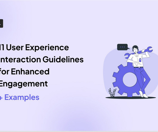
Alongside usability testing, userexperience interface guidelines allow you to build more intuitive and user-friendly solutions. In this blog, we explain eleven userexperience and interaction design guidelines supported by real-life examples to improve product engagement. System status visibility.
Would you like to learn how to design a SaaS metrics dashboard for your team without any coding? In the article, you will find examples of various SaaS dashboards and learn how to create them with Userpilot analytics. If so, you're in the right place! Let's dive in, shall we? Let's dive in, shall we? To name just a few.
Functionality is a must when it comes to attracting customers, but it’s userexperience that helps you retain them. Wondering how to create an outstanding userexperience ? TL;DR UX design identifies user needs, wants, and pain points and creates engaging products that enable them to achieve their goals.
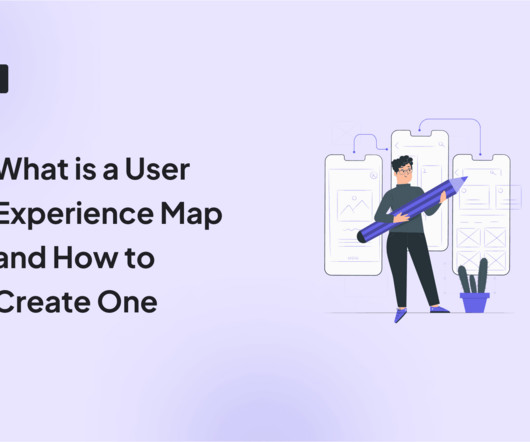
The solution might lie in your ability to create a comprehensive userexperience map. A well-crafted userexperience map can be your secret weapon for understanding customers, identifying pain points, and boosting product engagement. We also identify some best practices to follow when creating the userexperience map.
Much of the literature that defines the role as the intersection of business, technology, and userexperience isn't particularly helpful for practitioners who are left wondering what skills they need to learn versus the fine people they work closely with in actual business, technology, and userexperience roles.
And it’s key to ensuring users continue exploring the tool. Onboarding screens are great for driving users to the Aha moment. This is especially true when they’re used during signup to show dashboard screenshots, positioning messages, etc. Fullstory uses its first screen to collect user data.
For instance, by deeply analyzing the needs of the clients with visual impairment, UX experts can choose the most vital aspects presented in the graph and provide their text description correspondingly. To increase working efficiency, users can tweak dashboards and choose the most topical tabs. for Australia and Japan.
Without a strong and consistent digital brand, financial institutions risk being overshadowed by nimble Fintech startups or tech giants like Apple and Google that excel in userexperience. A strong digital brandensures: Customer Loyalty: A seamless and intuitive digital experience keeps customers engaged. million to 91.7
Companies already using Whatfix for web For teams already leveraging Whatfix on desktop, extending that functionality to mobile ensures a consistent userexperience across platforms. With a shared dashboard and content strategy, you can manage flows, tooltips, and updates without duplicating effort.
They track 47 different key performance indicators (KPIs) in their mobile analytics platform , spend hours debating dashboard numbers, yet can’t predict which users will churn next week The problem here isn’t a lack of data. ” So someone switching from urgent Slack messages to your app isn’t fully present yet.
Keeping this scenario in mind, we are presenting the three ways in which test management tools help startups to expand. It Offers Enhanced Communication and Collaboration Test management tools permit several users to view everything in actual time. This provides you with a fast, flexible, and strong userexperience.
Well, you hit two birds with one stone, significantly enhancing both the userexperience and the overall effectiveness of the learningprocess. Here are some key advantages: Improved user engagement: A well-designed application captures users attention and keeps them engaged.
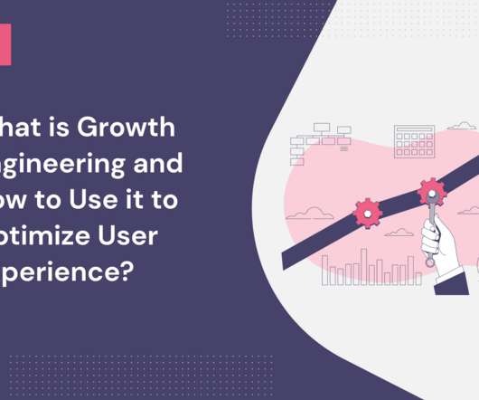
This data makes it easier to optimize product features and improve them to better the userexperience. Ultimately, growth engineering enables SaaS companies to iterate quickly, experiment with possible new solutions, and implement major or minor userexperience improvements. Growth hacking vs. growth engineering.
This resource allocation reflects a fundamental truth: understanding and optimizing the current userexperience often yields more substantial results than the constant introduction of new, unvalidated features. Tools like click tracking and funnel analysis help pinpoint where users encounter difficulties during onboarding.
Tali was so excited to share her experience with opportunity solution trees, she led a workshop at UXDX in Dublin. To prepare for the workshop, Tali created a fictional case study, and with the help of ChatGPT, she generated six interview snapshots and some analytics dashboards.
Highlight any improvements that enhance existing functionality Clearly explain how the improvement will enhance the user's experience and quantify the improvement if possible. For example, telling users that the dashboard loading time has been reduced by 50% shows commitment to continuous improvement to keep them happy.
Embedded analytics solves these pain points by providing insights directly within your application, allowing sales teams to track performance metrics in their CRM and operations teams to monitor workflows through embedded dashboards. Visualization: Presenting data through intuitive charts, dashboards, or reports.
Fast and personal messenger-based conversational support tools that offer a high-quality, delightful customer experience, but which can lack the underlying flexibility to accommodate the complexities of every type of business. Reporting upgrades. We are offering a leap forward in customer support – the days of compromise are over.
Users describe this overall poor UX experience in multiple ways: A time-consuming process Too difficult to learn Clunky and confusing interface Insights are spread out across multiple sections 2. Customers are frustrated because the reports don’t present the data they really need.
When you see users creating workarounds, repeatedly checking settings, or abandoning flows at specific points, you uncover the reasoning behind the metrics. Take a look at real userexperiences to understand your users better Conventional tools show you what’s happening, but understanding why requires deeper analysis.
That led me down one final rabbit hole, but a very useful one, as I soon realized that Framework was a perfect fit for one of my fractional CTO client’s “data science reporting and dashboard” needs. The non-profit’s primary user-facing (farmer-facing!) The majority of their team are data scientists.
For example, when launching a new feature, the right data visualization tool will let you track user interactions through a funnel report. The goal is simple: make data easy to understand and improve userexperience quickly. Pricing starts at $30/user/month, with a free trial available.
A good survey should directly match the target users needs and circumstances. If respondents think a survey fits their circumstances, theyll feel their response contributes to a better userexperience. Some include: Addressing users directly: This is the most basic form of personalization. smilies, stars, numbers, etc.).
No-code and low-code data collection : Allows non-technical users to gather and manipulate data easily, democratizing data access and improving productivity. Reports and dashboards : Presents data in a digestible format, providing real-time insights and key performance indicators to help teams monitor progress and make informed decisions.
Customer analytics is the cornerstone for making informed decisions, enhancing the userexperience, and, ultimately, fostering growth. To collect both quantitative and qualitative data, you should use user surveys, event analytics , and dashboards to track core metrics. This allows you to create positive userexperiences.
TL;DR Product analytics tools analyze user interaction, preferences, and engagement with a product. They provide insights to improve userexperience and meet customer needs. They offer data visualization, analyze user behavior data, and identify friction points to improve customer experience.
Things seem great initially, but soon enough, you see your analytics dashboard showing a constant decline. Many product teams know this feeling: mobile user retention is dropping, even after big updates and splashy feature releases. Frequent app crashes: Technical glitches or slow load times disrupt the user journey.
How Memory Affects User Interaction Memory plays a pivotal role in userexperience design. Key Memory Principles for UI/UX Design Leveraging principles of human memory in UI/UX design can significantly enhance the userexperience by making interfaces more intuitive and easier to navigate.
Whether you’re dealing with customer demographics, supply chain logistical management , financial data , or presenting to executives, clients, or colleagues, you can adapt the visualization to align with their needs. Tailor the experience for your users by eliminating any default chart types that may not suit your specific needs.
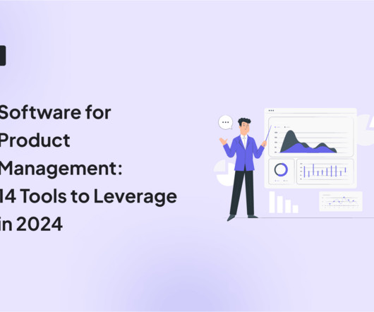
TL;DR Choose a product management platform with advanced features, a user-friendly interface, customization, third-party integrations, scalable pricing, robust security , and collaboration features. Userpilot is a top product management software that enhances userexperiences by effectively monitoring user behavior.
Userpilot lets you analyze survey data with in-app feedback forms that allow you to collect data, survey analytics dashboards for visualization, and NPS tagging for easy analysis. Try Userpilot and Take Your UserExperience to the Next Level Get a Demo 14 Day Trial No Credit Card Required What is survey data analysis?
UserExperience (UX) Creating an intuitive and user-friendly interface is vital to engage users effectively. The userexperience encompasses how users interact with the platform, access predictions, and customize their settings. A seamless and enjoyable user interface encourages user retention.
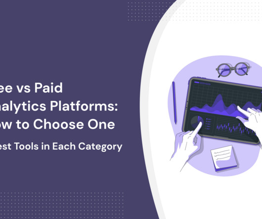
In this article, we’ll present the advantages and disadvantages of paid analytics platforms versus their free version counterparts and the best tools for each category. UXtweak is the best free userexperience research platform. Userpilot is the product growth platform for user journey analytics. Source: UXtweak.
Drag and drop analytics are interactive and user-friendly analytics platforms that allow users to analyze complex data sets and build custom dashboards and reports by themselves when they need them. . Drag and drop analytics solutions are very easy and user-friendly. What Is the Drag and Drop Functionality Exactly?
Reporting involves collecting and presenting data and organizing it into a structured form to ensure data-driven decision-making. It involves presenting existing data in a manner that makes it easy to identify trends, patterns, and otherwise hard-to-spot anomalies. Product usage analytics reporting in Userpilot.
Prioritization frameworks Gantt charts/roadmaps Documenting and organizing user research interview results Checklists and task management across teams Spreadsheets do have their drawbacks. You can’t use them to present to stakeholders, and they’re a nightmare for collaboration. We are fans of their “Collect, Explore, Present” concept.
Photo by NordWood Themes on Unsplash Measuring userexperience (UX) has always been a complex challenge, requiring a blend of creativity and data-driven precision. TSR: Indicates how effectively users can achieve theirgoals. A single, actionable metric that encapsulates multiple dimensions of userexperience.
We organize all of the trending information in your field so you don't have to. Join 96,000+ users and stay up to date on the latest articles your peers are reading.
You know about us, now we want to get to know you!
Let's personalize your content
Let's get even more personalized
We recognize your account from another site in our network, please click 'Send Email' below to continue with verifying your account and setting a password.


Let's personalize your content