This site uses cookies to improve your experience. To help us insure we adhere to various privacy regulations, please select your country/region of residence. If you do not select a country, we will assume you are from the United States. Select your Cookie Settings or view our Privacy Policy and Terms of Use.
Cookie Settings
Cookies and similar technologies are used on this website for proper function of the website, for tracking performance analytics and for marketing purposes. We and some of our third-party providers may use cookie data for various purposes. Please review the cookie settings below and choose your preference.
Used for the proper function of the website
Used for monitoring website traffic and interactions
Cookie Settings
Cookies and similar technologies are used on this website for proper function of the website, for tracking performance analytics and for marketing purposes. We and some of our third-party providers may use cookie data for various purposes. Please review the cookie settings below and choose your preference.
Strictly Necessary: Used for the proper function of the website
Performance/Analytics: Used for monitoring website traffic and interactions
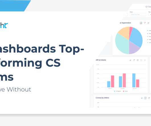
The Value of Using a Jobs Dashboard to Drive Your Demo Most software sales demos follow the same formula a handful of slides telling buyers about your company followed by an overview of the product, and then you dive into the demo. The jobs dashboard is your way of serving the meal in easily digestible portions.
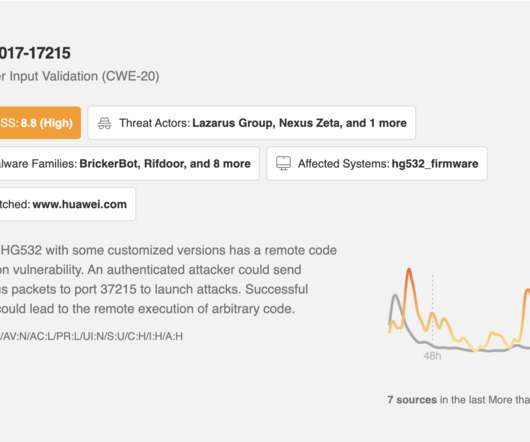
The Leo CVE Dashboard gives you at-a-glance visibility into relevant trending vulnerabilities, and you can use Leo to focus any of your feeds for faster insight into risks impacting your business’s software, hardware, and application stack. All of this information is available at a glance via the Leo CVE Dashboard and throughout your Feeds.
Plus, the ability to create custom NPS dashboards allow you to analyze the results easily without writing a line of code. Get real-time access to customer feedback via a centralized dashboard that updates as responses come in. Visualize detailed reports with advanced data segmentation and dashboards.
Example: Imagine you’re designing a new dashboard for a fintech app. Example: For our dashboard, we might ask, “How might we create a dashboard that helps analysts quickly spot trends and take action?” Example: Imagine you’re designing a new dashboard for a fintech app. Big difference, right?
Speaker: Miles Robinson, Agile and Management Consultant, Motivational Speaker
Join Miles Robinson, Agile and Management Consultant, as he covers five key considerations for you to keep in mind when you’re updating your software or app to offer the latest in embedded dashboards. You’ll leave with a better understanding of where to begin on creating actionable, insightful dashboards.
For the past decade, in nearly every conference, the #1 problem cited by analysts and their managers has been the same: their team built the best possible model (read: analysis, dashboard, report, predictive model) but people are not using it. Why are they requesting that dashboard, analysis, or model? or they simply don’t trust you.
In our recent Productside Stories webinar, Ryan Cantwell (Principal Consultant & Trainer) at Productside) joined our COO Cynthia Petti to break down what product operations (ProdOps) actually is, how to spot when you need it, and (just as importantly) how to avoid turning it into another layer of process that slows everyone down.
Where: Prioritised and MTP Leader members can access the AMA from their dashboards. Lily enjoys working as a consultant product manager with early-stage and growing startups and as a mentor to other product managers. The Australia and Singapore Government digital services. SafetyCulture.
Way back, when I started the Product Bistro, I had a lot of spare time (between gigs), and I was using the blog to drum up some consulting, and piece work to fill in the gaps and time. I was getting pretty solid referrals from them (checking my Google Analytics dashboard). It worked – somewhat. Until one hit the wire.
Dashboard screens are nice to look at but hard to make correctly Image Credit: Andrea. If you’ve had a chance to jump into a new car lately, undoubtedly your attention has been drawn to the dashboard screen that just about every car has nowadays. The Problems With Dashboard Screens. What All Of This Means For You.
Josh Seiden is co-founder and principal at consulting firm Neo. They track their progress with a risks dashboard, where they lay out every possible risk in their service regarding things like profits and business models. They also use the dashboard to note whether the risk is yet to be tested, being tested, or validated.
Our SDK is instrumented into mParticle, and when a mParticle customer decides to leverage Apptentive, a switch is flipped on in their dashboard which gives them immediate access to Apptentive. Apptentive also offers “codeless integration” through mParticle, without requiring customers to create a new series of events within their apps.
Build a dashboard to monitor new and returning users, retention metrics, and onboarding conversion rates… and that’s pretty much it, right? As Paul Sartori adds: “Why not do that in the first place instead of wasting time on pretty but pointless dashboards.”. What do we do with that information after the first month or two?
In a commissioned study by Forrester Consulting on behalf of Intercom undertaken in April 2021, Drive Conversational Experiences for a Future-Ready Customer Support Strategy , we learned that only 37% of support leaders and decision-makers are satisfied with their organization’s current digital channels and solutions.
These are some of the inputs that businesses can put into a revenue cycle management (RCM) dashboard to understand if it’s scaling profitably. Mark says some of the large consultancies have partners who can network, make the appointments, close deals, and lead the delivery. And the teams now need a more defined structure.
A customer experience that isn’t anchored on a single set of values will quickly start to feel fragmented – especially when team members can’t readily consult one another when issues come up. Frequent postings of our metrics dashboard on Slack to replicate our real-time metrics monitor at the office.
During my 5 years at Gainsight, from SDR to Solutions Consultant, a question that would come up regularly from prospects was, “All of this is great, the health scores, CTAs, etc., Horizon Analytics has a dashboard or report suitable for your goals, from simple personal dashboards to advanced ROI tracking. . Executive Dashboard.
What every great consultant does?—?I file extracts, reports, and an interactive dashboard. I lead an enterprise software company in the healthcare space. I finally have a chance to do something about dreaded implementation experiences. What did I do? I got the leadership team together in front of a whiteboard.
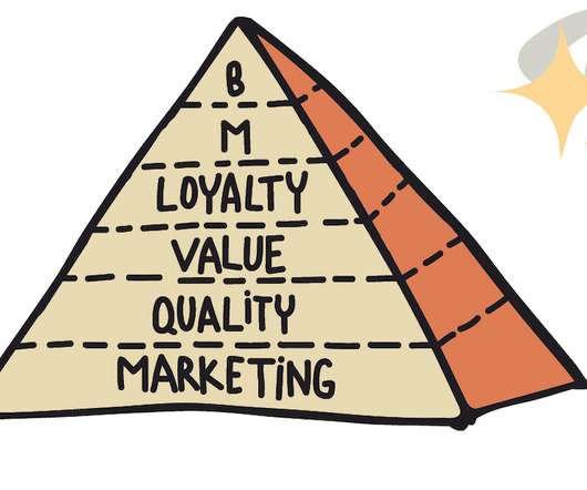
there are many ways to connect and organize metrics and dashboards. As a consultant on advanced analytics, I often hear, “ Our business metrics were rising. Brainstorm Ask your team: What are the key metrics on our dashboards, reports, and ad-hoc calculations? Metrics Pyramid, Metrics Hierarchy, Unit Economy, Funnels?—?there
A good example of the power of data is being shown by the product managers at Bacardi and Mercedes-Benz who have turned in part to a dashboard of analytics that has helped them to extend their product development definition. – Dr. Jim Anderson Blue Elephant Consulting – Your Source For Real World Product Management Skills.
. “First developed in 2001 by Fred Reichheld, NPS quickly became a key metric in all sorts of industries, an agreed measure of customer loyalty” First developed in 2001 by management consultant Fred Reichheld, NPS quickly became a key metric in all sorts of industries, an agreed measure of customer loyalty.
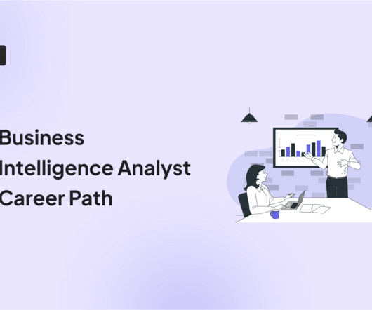
They don’t just crunch numbers; they translate their findings into clear and compelling stories through reports, dashboards, and presentations. BI Analyst (3-5 Years) : You’ll take on more responsibility for independent data analysis, report creation, and dashboard development.
As a VP of Product at Roam Digital, a full service consultancy, I’ve had the opportunity to work on a wide range of B2B and B2C products. One great example was a dashboard aggregation product we developed with a client. For us, it was that act of adding at least three tools to their dashboard.
When I, as a hiring manager, look at the resume of the analytics engineer that built the Economic Industry Dashboard project and see someone is just starting in the field, I do not consider this a red flag against them. My experience has taught me that the best experience can be found in consulting jobs.
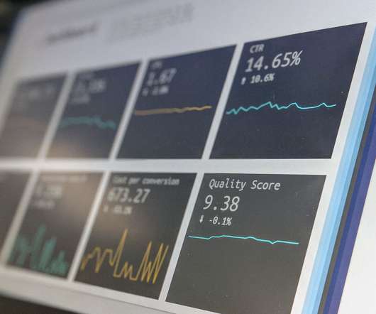
Google Adwords dashboard showing advert click-through rates. Stripe seller dashboard showing the meal plan sales (with one refund to an unresponsive buyer). The click-through rate for all three adverts was in excess of 7%, well above target! People seemed to be very interested in the product and not put off by the cost. The Lesson.
Val has experience in a number of different sectors, having started out as a stage manager for operas before moving onto life as a virtual assistant and eventually setting up her own consultancy firm, Fix My Churn. One did consulting, one had a T-shirt company, one had an imported goods company. Val: Well, a welcome email.
In our product management training and consulting practice , we always begin by coaching product managers to start from a strategic perspective. The mobile metrics here are more obvious, yet it’s still important to include them explicitly in your dashboard, so that you are always keeping your eye on achieving your business goals.
When you install Google Analytics on your website, you gain access to a basic data-dashboard in exchange for sharing insights with Google. To create this framework, you will likely need to work with an analytics consultant and/or technical specialist. Customize your data dashboard to reflect the unique considerations of your business.
User analytics: The custom analytics dashboard provides a centralized view of customer data, allowing you to segment, filter, and analyze user behavior. Analytics dashboard in Userpilot. Customization options Pendo provides limited customizations when building dashboards, creating surveys, or reporting customer data.
Our SDK is instrumented into mParticle, and when a mParticle customer decides to leverage Apptentive, a switch is flipped on in their dashboard which gives them immediate access to Apptentive. Apptentive also offers “codeless integration” through mParticle, without requiring customers to create a new series of events within their apps.
Last week, one of my customers consulted with me on what is the best metric to trace for the migration from an old system to a new one. When you see the numbers on the dashboard, you will immediately know if they are skewed because of the compromises you had to make or if that’s just reality.
Easy set-up and visualization : “It was really easy to set up a basic dashboard and get a visual of the data I felt was important. Fast and easy to analyze data : “Indicative has a series of tools designed for fast data consultation. To see how Indicative compares to other companies, click here.
No-code tool for event tracking, reports, and custom dashboards. Behavioral data analysis with an interactive dashboard. Set and track events, view everything in a centralized dashboard, and build reports to share with stakeholders. Pricing : Refer back to the all-in-one tools section or consult with our sales team.
Analytics dashboards : Find essential adoption metrics, such as the number of active users , user sessions , average session duration, etc., You can also create custom dashboards using metrics of your choice. Userpilot’s analytics dashboards. You can book a consultation that comes with a 14-day free trial. GA dashboard.
Sometimes, cross-platform development may not even be the best option for software projects including streaming, graphs, and dashboards. Process: including strategy and consulting, design, branding, support, and maintenance. Programming languages: HTML, CSS, JavaScript, Python, PHP, etc.
Our eG Enterprise solution offers full support for Citrix Remote PC which gives Citrix admins the exact same in-depth monitoring, dashboards and reports as they are used to with Citrix Virtual Desktops and Apps. Barry Schiffer is a pre-sales consultant at eG Innovations. Monitoring Citrix Remote PC with eG Enterprise. About the Author.
Craigslist: Ideal for Connecting with a Broad, General Audience (With a Few Caveats) Ellen Juhlin , a product coach, consultant, and Product Talk Academy instructor , was working on a wearable voice communication device in a previous role. Click the image to see a larger version.
In more than 20 years as a consultant helping businesses achieve digital transformation , I’ve noticed that successful growth hackers approach customer data in a radically different way than legacy enterprise businesses. They mostly track web activity in a dashboard. After all, pageviews don’t buy products—people do.
Alchemer Pulse has turned our research strategy on its head,” said John Pimm, Chief Operations Officer at International Research Consultants (IRC). Alchemer Pulse uncovers ideas and concepts that an organization may not think to ask, and it provides details that would be difficult to uncover in a structured survey.
A study by consulting firm Experience Dynamics found that 79% of users are prepared to search for another site if your business isn’t able to provide them with what they want. Delighted Dashboard. Feedier Dashboard. Promoter Dashboard. New NPS Dashboard Userpilot. Wootric Dashboard. The number one answer?
. “Not only do I look for people with CSM high-touch enterprise experience, but I’ve also broadened out and looked for people with no CSM experience and no SaaS experience but who have deep consulting experience. ” 3. “Not “Why do you have playbooks?
Cons of Userflow No built-in product analytics : You’ll need to integrate another tool if you want session replays, dashboards, or deeper usage data. A standout aspect was the data analytics dashboards, which are user-friendly and highly comprehensive.” — Victória F. WalkMe’s dashboard shows onboarding progress across flows.
Steve Krug, Web Usability Consultant and Author. And instead of merging all of the new features like new project types, more sophisticated project settings, and different feedback analysis dashboards to the old interface and making it overwhelming. Allow us to insert a cheeky promotion of our new dashboard design.
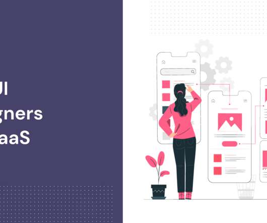
UserActive is a design agency founded by Peter Loving, a software designer, coach, and consultant for SaaS companies. and has been operating since 2011 with consultants in both London and Barcelona. Product advice or consulting. Dashboards. Data dashboard design. Top UI designers #1 – UserActive. UI redesign.
We organize all of the trending information in your field so you don't have to. Join 96,000+ users and stay up to date on the latest articles your peers are reading.
You know about us, now we want to get to know you!
Let's personalize your content
Let's get even more personalized
We recognize your account from another site in our network, please click 'Send Email' below to continue with verifying your account and setting a password.


Let's personalize your content